|

Graphical Reports / Burndown Charts
Published on
November 4th,
2022
Please see
Disclaimer,
Copyright Notes and
Trademark Notes sections on the bottom of this page.
This document is
related to all standalone desktop versions of MS Project Professional/Standard supporting the
Graphical Reports feature.
Various versions
of burndown charts are utilized and interpreted in
several different ways in order to track and forecast
team’s progress in projects where SCRUM framework of the
Agile Methodology is implemented. Here, we are not going
to discuss how to create and use a burndown chart in a
project that follows this methodology, as it is out of
scope of this content, but instead, we will explore the
structure of these built-in charts, focus on the
particulars of customizing them and also discuss how MS
Project calculates the data of the fields referenced by
the reports containing these built-in charts; and then
we will discuss how to interpret the information
displayed on these charts in order to determine the
current status of a small non-CPM schedule and
also to forecast the project team’s future progress in
the implementation phase. Whatever methodology you
follow to plan and manage projects in your project
environment, you would probably be able to decide on how to
make use of these charts to your benefit after you have
read the content below.
In future pages, we will review all the
other built-in reports in detail and then discuss how to
modify and customize them for our projects. We
will also discuss how to create a custom report of a CPM project
from scratch by adding charts (except for the burndown
charts), tables and other
graphical elements to a blank report page, and then how
to customize these elements further in order to create
easy-to-read reports. And finally,
some new custom reports will be developed to further
demonstrate the capabilities of the feature. You can
create the same reports at your own pace by following
the steps explained throughout the development process
and then use these reports in your projects. Meanwhile,
you can visit the other articles related to the
Graphical Reports, here are the links:
Using Indicator Symbols in Task/Resource Tables in
Graphical Reports
Creating the Custom Graphical Report "This Week's Tasks"
A
graphical report may very
well include some text reports' content in tables
along with graphs and charts, and as such, we look over the text
reports of earlier versions while
discussing how to create graphical (and also visual) versions of some of
these reports in the eBook
Text Reporting in MS Project.
Note that MS Project allows us to have both
versions, Project 2010 and a later stand-alone desktop version, on the same
computer. So, by such a configuration, you can keep utilizing the text
reports, whenever you need them. In text reports,
you can filter, sort and group the values in the
table fields in order to interpret the project data so
as to understand the project status and to see the
variances from the planned values. While these text
reports may show you the current status of the project
and then they may help you with revising the project
plan to take corrective actions accordingly, you need
some graphs and charts that show you how the actual
values in the timephased-table versions of these fields
change against the planned ones over time or how they
trend such that you can interpret how the project has
been progressing so far (or how the team has been
performing so far) and somehow forecast how its progress
could be in future periods (or the team's future
performance) for taking preventive actions when
necessary. So, you need Graphical Reports that plot the
timephased data of these fields over the time periods in
order to see the trend and also to visually compare them
with each other. These graphs may also help you to
identify where to focus on the table data that the text
report contain.
Introduction
Reporting
capabilities of MS Project’s stand-alone desktop
versions/editions have been greatly improved by the
introduction of the Graphical Reports feature, starting
from MS Project Standard/Professional 2013. Some new fields in
the timephased category were added to the product along
with the graphical reports feature. The graphical
reports can reference to these fields; thus, the project
data can now be plotted against time in the charts,
which would be otherwise possible only by exporting the
project data to the other applications. As a result, how
certain project data are distributed over time can now
be visualized in the reports without leaving the
application. These are dynamic reports connected to
project data; in other words, they are dynamic in that once you create
a report, it will be automatically updated as soon as
the associated project data change; you do not need to
produce the same report again, but instead, just refresh
it. Besides, the same custom
report can be used for the other project plans as well.
MS Project
comes with many great reports in various categories that
are ready to use right out of the box; see the
Reports
tab of the Organizer
dialog box for the complete list of the built-in reports
that were pre-installed to the product at the factory.
You can modify and/or customize these built-in reports
so as to suit your reporting needs or create your own
custom reports from scratch by utilizing capabilities of
the reporting feature. Note that the text reports
feature was discontinued by the introduction of the
graphical reports feature. Thus, MS Project 2010 (both
editions, Standard and Professional) was the last
version of the product that includes the text reports.
Some new
task filters are now also available in MS Project
Standard/Professional 2013 and later versions. These
filters are interactive but they do not prompt for any
information, since MS Project automatically feeds the
required dates into these filters, calculated based on
the current date entered (or coming from the system
clock by default) in the
Project Information
dialog box; visit the
Filters
tab of the Organizer
dialog box in order to see the new pre-defined task
filters added to the product. Some built-in graphical
reports display task data filtered by these advanced
filters.
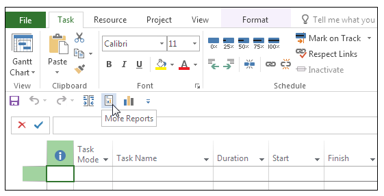
The
Report Tab: Commands
In this
section, we are going to explore the first part of the
user interface of the graphical reports feature that
enables us to communicate with MS Project until we open
an existing or new report page. The
Report
tab on the ribbon contains all the commands to create or
open the graphical reports.
There are
three ribbon command groups under the
Report
tab: Project,
View Reports
and
Export.
The Project
group contains only the
Compare Projects
button which opens the
Compare Project Versions
dialog box while the
Export
group contains only the
Visual Reports
button that opens the
Visual Reports – Create
Report dialog box.
Here are the
details on the command buttons in the
View Reports
group:
-
The
View Reports
group contains command buttons representing built-in
report categories, namely,
Dashboards,
Resources,
Costs,
In Progress
and Getting
Started; any
built-in report available under a category can be
accessed by selecting from the drop-down report list
opened by clicking the associated category button.
Here, we are going
to categorize the built-in reports based on which report
elements they contain and what kind of project data they
visualize. The reports in the
Getting
Started tab
of the Reports
dialog box are like infographics with links, that
connect them to help pages, views and/or other reports.
You can jump to another view or report by clicking the
links on these info-reports.
-
The
Custom
button in the View Reports group
opens a drop-down menu listing the custom reports
created in the active project plan file; we can
select any report from the list to access it
quickly. In a blank project plan file just opened,
the drop-down menu contains only the
More Reports…
command which opens the
associated dialog box when selected. Note that the
active project plan’s pane in the
Reports
tab of the Organizer dialog box
also lists the custom reports along with the
built-in ones accessed before.
-
The
drop-down menu of the
Recent
button in the View Reports group
contains all the reports that have been accessed
before, in the active project plan file. In a blank
project plan file just opened, the drop-down menu of
this button lists only the
More Reports…
command which opens the
associated dialog box when selected.
-
The
New Report
button in the
View Reports group
opens another set of buttons which leads us through
the first step of creating a report by choosing
either opening a blank report page or starting off
with a report page with some default elements on it
such as a table, a chart or two charts for a
comparison.
-
All the
command buttons in the
Report
tab, except for the
New Report
button, contain the
More Reports…
command, as the last item on
their drop-down menus, which opens the
Reports
dialog box. This dialog box contains all the command
buttons in the View Reports
group.
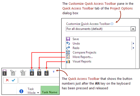
Customizing the
Ribbon for the Report Tab Commands
MS Project allows
us to customize the ribbon. Thus, we can simplify the
graphical reports user interface, as explained step by
step below:
In the tab
page, first select All Commands in the
Choose commands from
drop-down menu on the left section, then select the
More Reports…
command in the list box (review the list for the other
commands associated with the graphical reports since you
might want to use some of them too later on).
See it to
verify that For all
documents (default) has
already been selected
in the
Customize Quick Access
Toolbar drop-down menu on
the right section since we want
our customizations applied
to all the active project plan files.
Click
Add>>
to add More Reports…
to
the list box on the right
which contains the commands included in the
Quick Access Toolbar.
It will be added below the command selected on the list.
Once added, you can move
More Reports…
up or down on the list to determine its position on the
Quick Access Toolbar.
Repeat all
the steps for both commands
Compare Projects
and Visual Reports.
-
Click
OK
to close the dialog box and verify that the changes
have been applied to the
Quick Access Toolbar
as soon as MS Project returns to the project screen.
-
Now click the arrow at the end
of the Quick
Access Toolbar and
select Show
Below the Ribbon.
-
Right click anywhere on the
ribbon again, and this time, select
Customize the Ribbon…
on the shortcut menu opened in order
to go to the Customize Ribbon
tab in
the Project
Options dialog box.
-
Uncheck the checkbox of the
Report
tab in the list box on the right section.
-
Click
OK
to close the dialog box and verify that the
Report
tab is no longer visible on the ribbon as soon as MS
Project returns to the project screen.
That is how the
resulting project screen looks like now:
As a result,
from this point on in this page, the descriptions of the
navigation steps will commence with “click the
More Reports…
button on the Quick
Access Toolbar to open the
Reports
dialog box” or just “open the
Reports
dialog box”.
The order of
the buttons on the Quick Access Toolbar will
of course vary depending on how the user customizes MS
Project’s user interface. Thus, based on our
customization scenario, we can now open the
Reports
dialog box quickly by using the keyboard sequence <Alt>
and <5>. There is no need to remember the shortcut
sequence since MS Project displays the numbers below the
command buttons as soon as the Alt key has been pressed;
see below:
As an
alternative, these three commands can be placed under a
separate group in the
Project
tab, by following the steps described below:
-
In the
Customize Ribbon
tab of the Project Options dialog
box, right-click on the
Project
tab’s checkbox in the
Customize the Ribbon
pane on the right.
-
Select
Add New Group
on the shortcut menu to insert a new group as the
last item.
-
Right-click on
New Group (Custom) and
enter <Report> as the display name.
-
Select
All Commands
in the Choose
commands from
drop-down
list on the left pane.
-
Locate
the three commands on the left pane and then add
them to the custom command group named
Report (Custom)
on the right pane by clicking
Add>>
button. Remove the
Add-ins
group if you do not use it in order to shorten the
Project
tab.
-
Click
OK
to close the dialog box. The
Project
tab on the ribbon will now look like this:
These simple
customizations may reduce the overall navigation time,
thus increase productivity, while working on project
plans in MS Project.
In the
Project Options
dialog box, the
Reset
button in the
Quick Access Toolbar
tab allows us to undo either the toolbar customizations
only or all the customizations. The command
Reset only Quick Access Toolbar
will be grayed out, if there exist no customizations.
Similarly, the
Reset
button in the
Customize Ribbon
tab can be used to undo either the selected ribbon tab
customizations only or all the customizations. If there
are no customizations on the ribbon tab selected or on
the entire ribbon at all, the command
Reset only selected Ribbon tab
will be grayed out.
Contextual Tabs:
Report Tools, Chart Tools, Table
Tools, Drawing Tools and
Picture Tools
A contextual report tab appears as
soon as you select an element in a report page (i.e., a
picture, a drawing object, a table or a chart) and it
contains all the commands that you may need while
editing that element. While the ribbon shows the core
tabs in the tab row all the time, the contextual tabs
are hidden when they are not needed. In this section, we
will explore the contextual report tabs.
Let us now type in the key
sequence <Alt> and <5> on the keyboard to open the
Reports dialog box. When it is opened, the
Reports
dialog box always shows the Custom tab, where we can see
the custom reports previously created in the active
project plan file. But we are going to select the
New
Report tab in the Reports dialog box displayed (note
that we do not need to keep the <Alt> key pressed,
hitting it once is enough to activate the numbers):
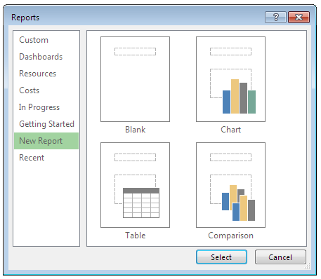
A new report page can be opened in
MS Project by double-clicking one of the four buttons in
the New Report tab (or clicking a button first to select
it and then clicking Select). Instead of starting with a
blank report page by selecting the Blank button, we can
use one of the other three buttons,
Chart,
Table and
Comparison, in order to start with a report page that
contains one or two default elements, such as a chart, a
table or two charts, respectively.
As soon as the selection process
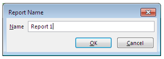
described above is complete, MS Project displays the
Report Name dialog box; the
Name box on it contains a
default report name in the format <Report #>. The number
(#) in the report name is automatically generated by MS
Project by counting the default report names that have
been previously used, starting from 1:
It is always better to enter a new
descriptive name for the report instead of using the
default one, and for example, you may include uppercase
letters in the report name in order to easily
distinguish it from the built-in ones.
Let us now explore the new report
pages that MS Project creates with default elements and
the associated contextual ribbon tabs that appears along
with each report page:
-
The Blank button opens a blank
report page with a title box (i.e., a text box)
containing the report name. At this moment, the
ribbon shows the contextual ribbon heading
Report
Tools and the contextual ribbon tab
Design below it:
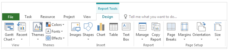
The Report Tools |
Design tab
is the main contextual tab that the ribbon always
displays while the active view is a report view that
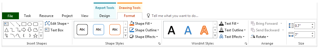
shows a report page. As soon as we click the title
box to select it, the ribbon shows the contextual
heading Drawing Tools with the
Format tab, see
below:
At the same time, MS Project
sets the focus to the text inside the box and shows
a blinking cursor over the title text to indicate
the point starting from which we can enter text by
typing in the box.
-
The Table button opens a
report page with a title box containing the report
name, and a task table containing the fields
Name,
Start,
Finish and
% Complete, at the project summary
level, by default.
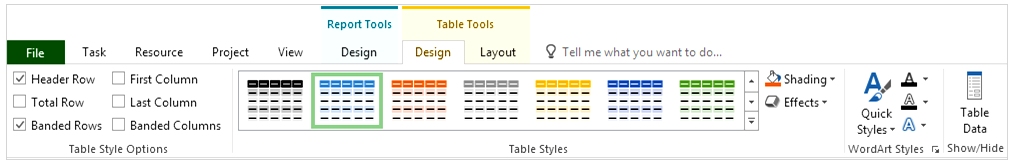
Since the table report opens
with the table already selected by default, the
contextual tabs associated with the table element
automatically appear on the ribbon. So the ribbon
now shows the contextual heading
Table Tools with
the two contextual tabs Design and
Layout (i.e., a
tab group) along with the main contextual tab, in
the order they are demanded, to the right of the
last core tab (i.e., View) in the tab row:
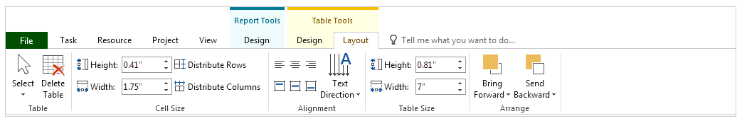
Note that the heading (or the
label) Table Tools displayed in the application
title bar spans all the associated contextual tabs
in the tab group.
-
The Chart button opens a
report page with a title box containing the report
name, and a task chart that shows the actual,
remaining and current work values for all the active
tasks at the outline level 1. This is a clustered
column chart that plots the fields
Actual Work,
Remaining Work and
Work against the names of the
tasks by default. Since the chart report opens with
the chart already selected by default, this time,
the contextual tabs Design and
Format with the
heading Chart Tools appear on the ribbon next to the
main contextual tab:
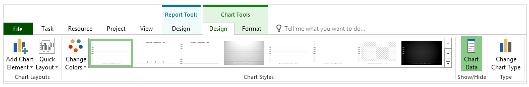
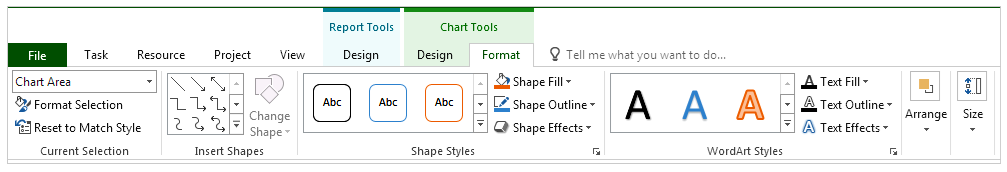
The Chart Tools contextual tab
group contains all the command that we need to
design our custom charts. After having inserted the
default chart to the report page, we first need to
select the field(s) and the category against which
the custom chart plots the selected field(s)’ data,
and then we can customize the appearance of the
custom chart and the format of the information it
presents.
The Comparison button opens a
report page with a title box containing the report
name, and two task charts. The first chart shows the
remaining and actual work values for all the active
tasks at the outline level 1. This is a clustered
bar chart that plots the fields
Remaining Work and
Actual Work against the names of the tasks by
default. The second chart is the same as the chart
that the report page opened by the
Chart button
contains by default. Note that the clustered bar
chart displays hours on the x-axis, while the
clustered column chart does it on the y-axis. Since
the comparison report opens with the first chart
already selected by default, the contextual tabs
Design and
Format with the heading
Chart Tools appear on the ribbon next to the main contextual
tab.
In the bulleted paragraphs above,
we have explored the details of the report pages opened
by using the four new-report buttons, as well as the
contextual tabs associated with the default elements in
these reports. We will now explore another contextual
tab which is Picture Tools |
Format:
-
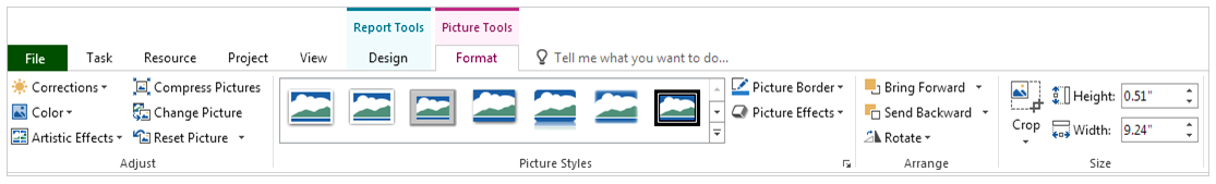
Now open a blank report page
and check the Timeline box on the
View tab in order
to have a combination view of the
Timeline and
Report views. Right-click on the
blank space above the timeline and select
Copy Timeline |
For Presentation on the menu in
order to capture a picture of the timeline in the
clipboard. Next right-click on any blank point in
the report page below and select
Picture
in
Paste Options
to copy the image of the timeline from the clipboard
to the report page. At this point, as soon as you
select the timeline picture just inserted, the
contextual tab Format with the heading
Picture Tools will appear on the ribbon with all the command that
we need to format the picture:
We can insert the timeline
picture to the graphical part of the
Gantt Chart view too, but there, the ribbon does not display any
contextual tabs to format the picture when selected.
Note -- The headings and
commands may look slightly different among versions
supporting the Graphical Reports feature --
This concludes our
discussion on the user interface for now. Shortcuts and
Panes will be discussed later.
· · ·
Let us now get started with discussing
the burndown charts. As mentioned before, there will be no further discussions on
the burndown charts other than this in future pages where we will be exploring all the
other reports in the built-in graphical report set. As you may have already
noticed, some report elements (i.e., charts and tables) are included in several
built-in reports. Also, many report elements have the same field-list pane settings. We
will later review all these common elements and settings in detail, which are
related to the layout and the design of the default reports included in the
built-in set (except for the burndown charts).
Fields
Referenced in Task Burndown Chart
The three number-type task-timephased
fields, Remaining Tasks,
BaselineX Remaining Tasks and
Remaining Actual Tasks were added to MS Project along
with the graphical reports feature, starting with the
version 2013. The TASK BURNDOWN chart, which is the only
report element that references these fields in various
reports of the built-in set, shows these field’s data at
the project summary level as line graphs, where the
total numbers for the tasks on the vertical Y-axis are
plotted against time periods on the horizontal X-axis.
Therefore, before discussing how to interpret the TASK
BURNDOWN chart, we first need to understand how MS
Project calculates the number-of-tasks data that these
fields hold at any summary level in any specified time
period of a project’s timeline.
Note -- Search on the product website for the help
page titled “Available fields reference”. This page
lists all the fields available in MS Project and
contains links to the other pages describing them in
detail --
How Does MS
Project Calculate Numbers at Task Level ?
Let us first explore how MS Project
calculates these fields’ data at the task level, which
are in turn used to calculate the summary level data. In the
timescaled table part of the
Task Usage view, set
the period to days on the timescale (i.e., the lowest
tier should display days), and then select and add any
of the three fields to the details by using the
Detail Styles dialog
box.
Remaining Tasks
field at the task level
The
value of the Remaining Tasks
field for a task in a project schedule (that is, a
regular task at the outline level 1, below the project
summary task, or a subtask of a summary task at any
other outline level) is determined according to its
finish date. The value in all periods prior to the
task’s finish date is 1, while it is set to 0 in all the
days on and after the task’s finish date.
In
other words, on any given day, the
Remaining Tasks field
is set to 0 for a task if the task is scheduled to
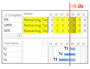
finish on or before that day. Let us
see how it works in an example; the combination view in
the picture below, which is composed of
Task Usage on the
top pane and Gantt Chart
on the bottom pane, shows how 1s become 0s on the task
finish dates (see the column for the 19th) in
the Remaining Tasks
field (Os
in red colored-font means all
zeroes to the right):
Day is
a common timescale period preferred in most projects
since the task durations are mostly estimated as days,
but MS Project can display the field’s data at any
period available, if selected, such as minutes and
hours. On the other hand, do not get confused over the
numbers in the remaining tasks rows when the timescale
period is set to either minutes or hours, since the
field will show 1s instead of 0s until 17:00 on the
task’s finish date, if Standard is the project calendar.
The
current status of a task (i.e., whether it is complete
or not) does not affect its Remaining Tasks field’s values. But if its finish
date changes, as we would expect it to occur in a
dynamic schedule in both planning and implementation
phases, the day where the zeros start will be adjusted
accordingly.
Remaining Actual Tasks
field at the task level
As the
term “actual” in the name of this field implies, its
timephased values are affected by the task status. The
value of the Remaining
Actual Tasks field for a task in a project
schedule is determined according to both its finish date
and percentage of completion. The field is initially set
to 1 in all the periods (or days) for an incomplete
task, but it is set to all 0s on and after the task’s
finish date, as soon as the task becomes 100 percent
complete; see the task-timephased field for T2 below
whose % Complete
field shows 100%:
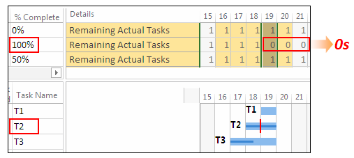
Note
that the Remaining Actual
Tasks field keeps 1s for T1 and T3 on and after
the 19th since they are not complete.
As a
result, unlike the Remaining Tasks field, the values in this field
change based on the task’s status; the 1s in all periods
on and after the task finish date will be automatically
replaced with all 0s as soon as the task’s
% Complete field’s
value becomes 100%. In other words, the field is set to
0 on any day for a task whose actual finish date exists
and it is earlier than or equal to that day; and
otherwise, it is set to 1.
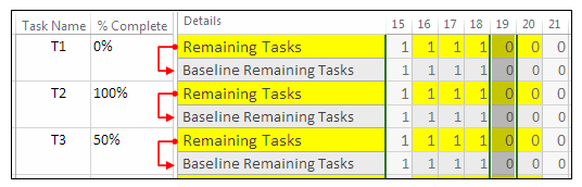
BaselineX Remaining Tasks
field at the task level
When a
baseline is saved, the Remaining Tasks field’s data are copied into the
field BaselineX Remaining
Tasks where X
represents the number of the baseline selected, 0
through 10 (0 means no X
or the first baseline). In the
example project, let us set the first baseline and then
add the Baseline Remaining
Tasks field to the details by using the
Detail Styles dialog
box in the timescaled table part of the
Task Usage view. As it
is seen on the resulting view below, the
Baseline Remaining Tasks
field shows the same values for the three tasks as the
Remaining Tasks field
after the first baseline was saved.
And finally, this is the view with
all three fields added to the details:
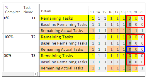
As it is seen in the view above, the
Remaining Tasks
field always holds 1s before the task finish dates, and 0s on and after the task
finish dates. The
Remaining Actual Tasks
field initially holds all 1s for a new task created, and then it becomes
identical to the Remaining Tasks
field as soon as the task has been completed, since it is also set to 0s on and
after the finish date of a completed task (see the blue frame that shows T2’s
remaining actual tasks data).
How Does MS Project Calculate Total Numbers at Summary Task Levels ?
In order to interpret the line
graphs of these three fields in the charts of the
various reports correctly, we need to know how their
values are calculated for the summary tasks, and
especially for the project summary task, which is the
outline level selected in the project level task reports
in a project plan. So, in this section, we will see how
MS Project calculates the values of the fields,
Remaining Tasks,
BaselineX Remaining Tasks
and Remaining Actual Tasks,
in the summary rows.
Note -- In this section, some of the discussions,
regarding how MS Project calculates the fields’
summary level values on the background, are based on
the information presented in the related help pages
of the product. Therefore, see the field description
pages for all three fields on the product website --
How Does MS Project Calculate the
Remaining Tasks
Field’s Data at Summary Task Levels ?
Let us get started with a short
schedule shown in the Task
Usage view below. Suppose that T2 is scheduled to
be completed on the 17th, which is its finish
date, so its remaining tasks row shows 0 on and after
the 17th.
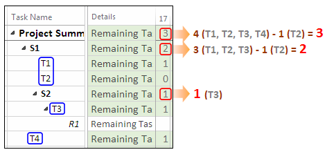
The field’s value is 1 for all the
other tasks in the column of the 17th, that
is, T1, T3 and T4, all of which are obviously scheduled
to finish at later dates. Note that the resource
assignment row (R1) is blank since there exists only
task‑timephased category of these three fields.
In order to find the number of
remaining tasks on 17th at the project
summary level, MS Project counts all the tasks in the
project plan and then subtracts the number of tasks that
are scheduled to finish on or before that day (i.e.,
Finish <= 17th )
from the total count; the result of this calculation is
3 in this example (see the project summary row in the
view above). Thus, the field’s value on a given day at
the project summary level is the number of scheduled
tasks that remain in the project on that day, regardless
of their status. And, as a result, the field’s value at
the project summary level corresponds to the total
number of tasks in the project in any timescale period
prior to the project start date (for example, in Day
-1), and 0 on and after the last day of the project.
Likewise, in order to find the
number of remaining tasks for any summary task on a
given day (or in any other time period specified), MS
Project counts all the subtasks below it and then
subtracts the number of subtasks that are scheduled to
finish on or before that day (or the period specified)
from the total count. As a result, the number of
remaining tasks for S1 and S2 on the 17th are
2 and 1, respectively. Thus, any summary row of the
Remaining Tasks
field shows the number of its scheduled subtasks that
remain in the project on any given day.
Since, in the project summary row,
the number of scheduled tasks that remain in a project
decreases from the total number of the tasks at the
beginning to zero tasks at the end of the project along
the project duration, the line graph of the
Remaining Tasks
field will always have a negative slope (i.e., a
decreasing trend) from left to right, as it is also seen
in the example chart below, which plots the number of
scheduled tasks that remain in the project (y-axis)
against the successive time periods in the project’s
timeline (x-axis), at the project summary level (the
values on both of the axes and at the data points on the
line graph are hidden to simplify the graph):
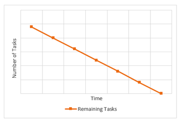
How the line graph’s steepness
varies downward between the first and the last data
points depends on how the tasks are distributed
throughout the entire project. In the example chart
above, the line graph’s uniform downward trend over time
periods reveals that all the one-period-long tasks in
the estimated schedule are distributed evenly over the
example project’s duration. But initial layout of the
tasks in an estimated schedule composed of tasks with
dependencies and in various lengths might not be
uniform. Also note that there may be flat parts on the
line graph, if the tasks span multiple periods, and/or
if there are periods with no tasks in the project.
A project’s schedule is dynamic, so
is the Remaining Tasks
field, and in turn, so is the chart which gets the
timephased numbers from the field to plot its line
graph. As MS Project automatically recalculates and
updates the timephased totals at all summary task rows
following any associated changes that occur in the
project schedule, it at the same time automatically
redraws the line graph on the chart of the graphical
report accordingly, as elaborated below. Note that these
changes may occur in any part of the project schedule in
the planning phase and in the remaining future parts of
the project schedule in the implementation phase:
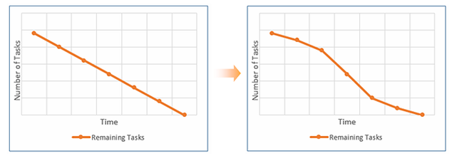
-
Changes in tasks’ schedules
may affect the distribution of the number of
remaining tasks over days (or any other time period
specified) at all summary task levels, as well as
the finish date of the project, but the total number
of tasks in the project remains unchanged. In other
words, the values both in Day -1 (i.e., the total
number) and on the last day (i.e., zero) remain
unchanged, but how the timephased numbers are
distributed in between them changes. MS Project
automatically redraws the associated parts of the
line graph on the chart accordingly. See the
resulting chart on the right side below after tasks
have been moved among the periods in the project;
obviously, the tasks are no longer distributed
evenly over the example project’s duration:
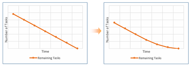
-
Adding tasks to and/or
removing tasks from the project schedule may affect
the total task number in the project, and the
distribution of the number of remaining tasks over
time at all summary task levels, as well as the
finish date of the project.
If such
updates to the project schedule occur, MS Project
automatically recalculates the timephased total values
in all summary rows of the field in all the periods of
the entire project and redraws the line graph
accordingly; see the example below, where some tasks
have been removed from the project:
In either scenario above, if the project’s finish date changes too, it may be
required to manually force MS Project to recalculate the time periods on the
x-axis, as follows: click
Edit
in the Select Category
section of the Field List
pane, empty both Start
and Finish
boxes in the Edit Timescale
dialog box just opened, and close it. Then MS Project will automatically
populate both blank date boxes with the new dates from the project schedule and
redraw the chart with the new x-axis periods adjusted accordingly. Afterwards,
you can open the dialog box again in order to check the new dates and/or to edit
them if you need to make further adjustments such as displaying Day ‑1 on the
x-axis by adjusting the date in the
Start
box.
How Does MS Project Calculate the
Remaining Actual
Tasks
Field’s Data at the
Summary Task Level ?
Going back to our previous example
project, suppose that T2 has been completed on the 17th,
as scheduled, on its finish date, so its remaining
actual tasks row now shows 0 on and after the 17th,
as it is seen in the column for 18th below:
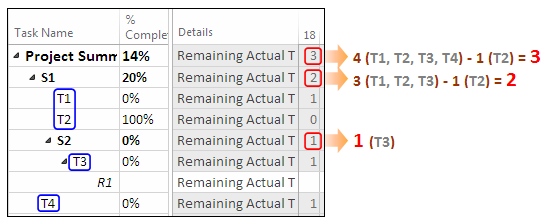
The field’s value is 1 for the
other tasks, T1, T3 and T4 on the 18th, since
none of them are complete on that day or earlier.
In order to find the number of
remaining actual tasks on the 18th at the
project summary level, MS Project counts all the tasks
in the project and then subtracts the number of tasks
that have been finished on the 18th or
earlier (see T2); the result is 3 in the project summary
row as it is seen above. Thus, the field’s value on a
given day at the project summary level is the number of
tasks that remain to be completed in the project on that
day.
To find the number of remaining
actual tasks for any summary task, MS Project counts all
its subtasks on the 18th and then subtracts
the number of subtasks that have been finished on or
before that day from the total count, so the total
numbers for S1 and S2 on the 18th are 2 and
1, respectively. As a result, any summary row of the
Remaining Actual Tasks
field on a given day shows the number of subtasks that
remain to be completed on that day.
When the project is still being
planned or has just begun, that is, when there are no
completed tasks in the project yet, the field’s initial
value at the project summary level is the total number
of the tasks in the entire project in any time period;
or rephrasing in terms of the field’s name; the number
of all the scheduled tasks that remain to be completed
in the project. At that moment, the line graph of the
Remaining Actual Tasks
field will be horizontal at the total number of tasks in
all periods, in a project summary level example chart
such as below (see the blue line):
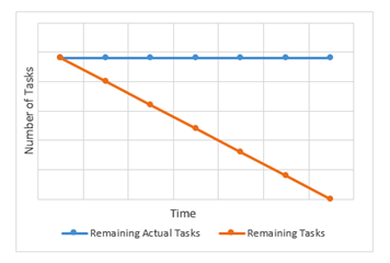
Changes in tasks’ schedules won’t affect the summary level totals in this field
since the total number of tasks in the project remains unchanged, so the field’s
blue horizontal line graph will stay at its current level. But if the tasks are
added to and/or removed from the project, the total task number in all the
timephased cells of the field in the project summary row will be recalculated
accordingly, and as a result, the blue line graph of the
Remaining Actual Tasks
field plotted in the number of tasks-versus-time periods chart above will be
adjusted to its new horizontal level corresponding to the new total number
calculated.
How Does MS Project Calculate the
BaselineX Remaining
Tasks Field’s Data at the
Summary Task Level ?
When a baseline is saved, the
Remaining Tasks
field’s data for any summary task, including the project
summary task, are copied into the field
BaselineX Remaining Tasks
for that summary task.
Let us see how the field’s line
graph looks like at the project summary level in an
example chart. On the left, see the gray line graph for
the Baseline Remaining
Tasks field, which is a flat line at zero tasks
since the corresponding baseline (the 0th
baseline which is the first one out of a set of 11
baselines) has not been set yet. As soon as the baseline
has been saved, the baseline remaining tasks line graph
overlaps with the remaining tasks line graph since the
task-timephased data in both fields become identical to
each other at the project summary level; see the
resulting chart on the right:
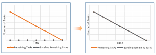
The orange line graph should be on
the top of the gray one since we will be mostly working
on it, but here, the field order is arranged so as to
make the gray one visible in the front for demonstration
purposes.
Below is a chart of a project that
has not started yet, as it can be concluded from the
horizontal blue line graph of the
Remaining Actual Tasks
field:
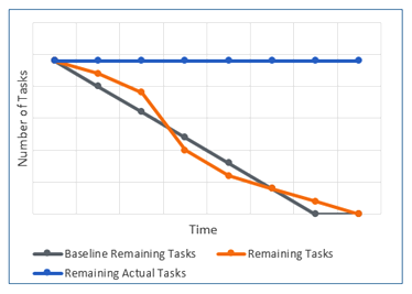
Comparing the gray line graph of
the Baseline Remaining
Tasks based on the original schedule with the
orange one of the Remaining
Tasks based on the current schedule tells us that
tasks’ schedules have changed and the project’s finish
date has been pushed back by one period, while the total
number of tasks in the entire project remains unchanged.
The variation in the steepness of the orange line graph
reveals that the tasks are no longer distributed evenly
over time in the project, as they were at the time of
saving the baseline.
As it is seen above, changes in
tasks’ schedules may affect the distribution of the
number of remaining tasks over time at all summary task
levels, as well as the finish date of the project, but
such changes are not automatically reflected to the
task-timephased data stored in the
BaselineX Remaining Tasks
field in the summary rows, unless it is explicitly
updated through the Set
Baseline dialog box. Therefore, this project will
probably be re-baselined before the actual work begins,
and that would result in a gray line graph overlapping
with the orange line graph.
The BaselineX Remaining Tasks field is a
calculated field.
Therefore, unlike a calculated and entered type baseline field, such
as the task-timephased BaselineX Work field, we cannot modify the values
in the BaselineX Remaining
Tasks field by manually editing the data, as the
only way to update the data in this field is to do it
via the Set Baseline
dialog box.
As discussed before, it might be
necessary to add tasks to and/or remove tasks from any
part of the project schedule in the planning phase, and
also from the remaining future part of the project
schedule in the implementation phase. Such updates in a
project schedule may change the total task number in the
project, and/or the distribution of the number of
remaining tasks over time at all summary task levels, as
well as the finish date of the project. When such
changes occur, how MS Project behaves regarding the
BaselineX Remaining Tasks
field’s data is explained below:
-
The baseline data of any task
deleted (or inactivated) disappears from the project
schedule, and MS Project recalculates and updates
the numbers in the associated summary rows of the
BaselineX Remaining
Tasks field for these tasks that no longer
exist in the project schedule accordingly, although
the associated baseline has not been explicitly
updated by using the Set Baseline dialog box. At that moment, in
the same project schedule, if you check the summary
level task-timephased data of the other baseline
fields, such as BaselineX Remaining Work field, you will see
that the values have not changed after the tasks
were deleted (or inactivated).
-
The task-timephased baseline
rows of the new tasks added to the project schedule
will be initially blank. In order for them to be
included in the task-timephased total numbers of the
BaselineX Remaining
Tasks field at the project summary level (or
any related summary level), the baseline should be
updated. Note that the chart plotting the baseline
remaining tasks is not used to track the variances
to the total number of tasks during the project’s
execution, which usually happens as a result of
changes in the scope. Following the update, the line
graph of the BaselineX
Remaining Tasks field coincides with that of
the Remaining Tasks
field in all periods.
· · ·
So far in this section, we have discussed how MS Project
calculates the three fields’ task‑timephased data over
time at the project summary level and updates them when
the project schedule changes in the planning phase. Also
we have explored how MS Project draws these fields’ line
graphs in a chart and redraws them automatically as soon
as the associated data in the fields change in the
planning phase. Note that all the information presented
here also applies to the fields in the implementation
phase as the planning activities continue in the
remaining future parts of the project during its
execution. In the upcoming sections, we will discuss how
these fields’ data and the charts plotting them look
like in the implementation phase of a small project.
Fields Referenced in Work Burndown Chart
In the
picture below, the boxes with yellow background contain
the names of the five duration-type timephased fields
that were added to the product along with the graphical
reports feature:
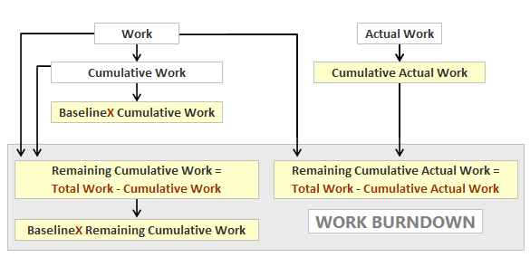
The
Work Burndown chart included in various built-in
reports plots line graphs of the three new fields
against time at the project summary level (see the gray
box). Although the product help pages contain detailed
descriptions for all the new fields, in this section we
will look further into these three fields referenced in
the Work Burndown
chart.
Note -- In this section,
some of the discussions, regarding how MS Project
calculates the fields’ data at all levels on the
background, are based on the information presented
in the related help pages of the product. Therefore,
see the field description pages for all the fields
above on the product website (search for the title
“Available fields reference”)
--
We cannot input values to these new
fields (i.e., the field entry type “calculated”), so MS
Project populates them with the values calculated from
the data in the fields Work,
Actual Work and
Cumulative Work.
The new fields’ work data,
calculated by MS Project in task-, resource-
and assignment-timephased categories, are stored either
as forward cumulative values in the fields,
BaselineX Cumulative Work
and Cumulative Actual Work,
or backward (or reverse) cumulative values in the
fields, Remaining
Cumulative Work, BaselineX Remaining Cumulative Work
and
Remaining Cumulative Actual
Work.
All these fields are dynamic except
for baseline versions, since MS Project automatically
recalculates the values in all the associated fields as
the work, actual and remaining work field’s data change
because of the updates and/or modifications done in the
schedule during both the planning and execution phases
of a project; for example, the actual work values
collected while tracking the progress are entered to the
schedule for the completed parts of the project, the
remaining work values are re-estimated in the schedule
for the uncompleted parts of the project while at the
same time re-planning the future work if required, tasks
(that is, work) may be added to and/or removed from the
schedule to accommodate the changes in scope, and
assignments may be modified as required by the resource
management activities.
This is how MS Project calculates
the work data stored in these fields in all categories,
as also depicted by the arrows in the picture above:
-
The
Cumulative Work field’s data, which show how the values in the
Work field
accumulate over time (i.e., forward cumulative), are
calculated in any period by adding that period’s
current work
value to the cumulative
work value of the previous period.
-
The
Cumulative Actual Work
field’s data, which show how the values in
the Actual
Work field
accumulate over time (i.e., forward cumulative) as
the project progresses, are calculated in any period
by adding that period’s
actual work
value to the
cumulative actual work
value of the previous period.
-
The
Remaining
Cumulative Work field’s value in any period is calculated by
subtracting that period’s
cumulative work
value from the
total work value.
-
The
Remaining
Cumulative Actual Work
field’s value in any period is calculated by
subtracting that period’s
cumulative actual work
value from the
total work value.
-
Both the
Cumulative Work and
Remaining
Cumulative Work fields’ timephased data in
all categories can be captured in the baselines,
which are BaselineX
Cumulative Work and
BaselineX Remaining Cumulative Work,
respectively, where
X
represents the baseline numbers, 0 through 10.
The only way to update the data in the
baselines is to do it via the
Set Baseline
dialog box.
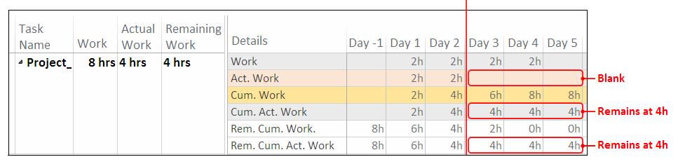
The Task Usage view below demonstrates how the
calculations are performed at various levels (i.e.,
project summary, task and resource assignment) in Day 2,
as it works similarly at all levels (and categories) and
in all periods:
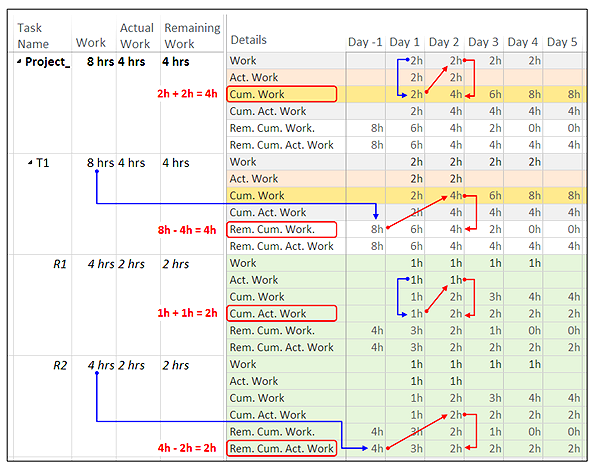
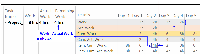
The expressions below represent the
calculations performed on the background:
Cumulative Work
in
Day 2 = Cumulative Work
in Day 1 + Work in
Day 2
Remaining Cumulative Work
in Day 2 = Total Work
- Cumulative Work in
Day 2
Cumulative Actual Work
in Day 2 =
Cumulative Actual Work
in Day 1 + Actual Work
in Day 2
Remaining Cumulative Actual
Work in Day 2 =
Total Work -
Cumulative Actual Work
in Day 2
Note that the values of both fields
Remaining Cumulative Work
and Remaining Cumulative
Actual Work, at any level, in and before Day -1
are equal to the total work
value that the Work
field holds at that level. Let us
now explore how the line graphs of the three fields of a
simple project plan look like at the project summary
level in a work burndown chart; this is the chart before
the project begins:
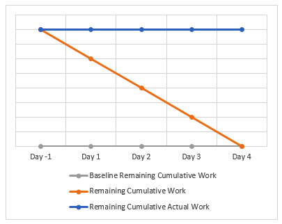
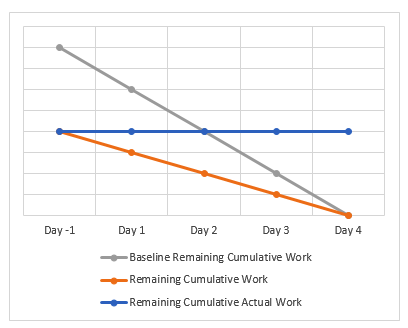
The Baseline Remaining Cumulative Work field’s line
graph is flat at 0 hrs since the associated baseline has
not been set yet. The Remaining
Cumulative
Actual Work field will be initially filled with
the total project work value in all periods at the
project summary level (i.e., when the project’s actual
work is zero), and therefore, the line graph of the
Remaining Cumulative Actual
Work field is horizontal at the total work value.
The graph of
Remaining Cumulative Work
field being a straight line with a uniform downward
trend from left to right reveals that the project’s
scheduled work has been distributed uniformly over the
project’s duration in the example project. But this may
not be the case with the real-world projects composed of
sequences of linked tasks of various durations. For
example, in the initial chart of an eight-week project
shown below, a steep drop in the amount of remaining
cumulative work in the last two weeks indicates that
much of the project’s work has been scheduled to be
carried out toward the end of the project, as required
by the structure of the project:
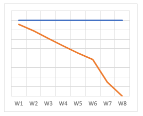
More work having to be done in
relatively short durations toward the end of the project
means that there would not be enough time to fix delays
that might occur in these periods. The chart, based on
the estimated schedule of the project that has not
started yet, helps us to identify such periods, and
thus, enable us to take actions early in the planning
phase to prevent any potential problems that might cause
delays in these periods; for example, you may now review
the project plan again for the profiles of the resources
already assigned to the tasks in these periods and then
you may decide to replace them with more skilled and
experienced resources. Also ensure that the tracking
method to be implemented in these periods during the
execution of the project enables you to monitor the
progress detailed enough and at the proper level so that
you get notified of any delays as soon as they occur in
these periods, and thus, handle them quickly.
Let us go back to our example
project plan, which has not started yet, and save the
first baseline; see how the chart looks like now:
The
Baseline Remaining
Cumulative Work field’s graph is now behind the
Remaining Cumulative Work
field’s graph, since it holds a copy of the
Remaining Cumulative Work
field’s data.
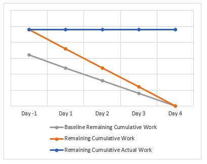
Comparing the
Remaining
Cumulative Work field’s line graph with the line
graph of the BaselineX
Remaining Cumulative Work
field, that was saved just before updating the project
schedule, graphically shows us how the distribution of
the scheduled work data over time has changed in the
chart. If a variance to the project’s total scheduled
work value occurs, it is easy to see this change in the
chart at the project level by looking at the start of
the line graphs in Day -1 where the remaining cumulative
work graph’s data point moves above or below the
baseline cumulative work graph’s data point depending on
whether the variance is positive or negative. The data
points at the end of the line graphs (see Day 4, the
last day of the project) always remain at zero for both
fields. Let us see how this happens by demonstrations.
We
will now inactivate (or remove) a task to reduce the
project work without changing the estimated finish date;
this is the resulting chart:
The
line graph of the baseline has remained unchanged while
the other two graphs have been adjusted according to the
new project work value which is now lower than before.
Let us revert to the previous chart, but this time, add
some work to the project, without changing the estimated
finish date; then the chart looks like this:
The
line graph of the baseline has again remained unchanged,
but the other two graphs have been adjusted according to
the new project work value which is now higher than
before. And
this is the resulting chart when we change the
distribution of the scheduled work but keep both the
total project work and the estimated finish date the
same:
The
remaining cumulative work’s line graph (i.e., the orange
one) getting steeper in Day 3 and Day 4 than in Day 1
and Day 2 indicates that more work has now been
scheduled to be completed in Day 3 and Day 4 than
before. The chart clearly shows that some amount of the
project work that was scheduled in both Day 1 and Day 2
has now been shifted toward the end of the project
without creating any variance to the baseline in this
particular project planning scenario since the lines
start at a common data point in Day -1.
Let us go back to the
Task Usage view of
the example project that we have seen earlier in this
section.
In that schedule, since there is no
actual work entered after Day 2, which is the status
date, the actual work cells are blank in all periods
following that day. Therefore, both the cumulative
actual work data and the remaining cumulative actual
work data remain at the same value in all periods
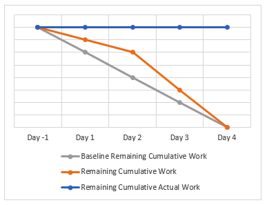
following Day 2. Therefore, the line graph of the
Remaining Cumulative Actual
Work field is horizontal (i.e., flat) after Day 2
in the chart below:
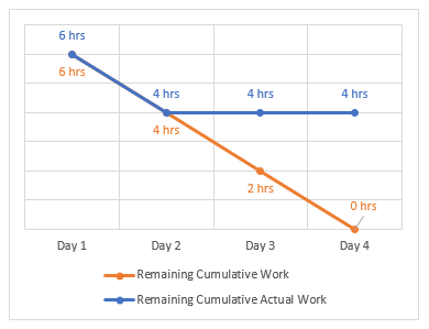
As soon as the actual work
information (or any other progress information) have
been entered to the project schedule for the periods
where the work was completed as scheduled, the data
points of the Remaining
Cumulative Actual Work field in the line graph
merge with the data points of the
Remaining Cumulative Work field in the
corresponding periods; see the data points in Day 1 and
Day 2 in the chart and the cell values in the view
below:
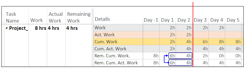
The Remaining Work field that can be displayed in a
task or resource table, which has no timephased
category, should not be confused with the
Remaining Cumulative Work
field. The Remaining Work
field holds the sum of the work values in the
uncompleted parts of a project, and is equal to the
difference between Work
and Actual Work,
thus it shows us how much work is left to be completed
at task, resource, assignment and project levels, and
also allow us to enter an estimated value for the amount
of remaining work in a task or assignment.
In a project schedule properly
updated with actuals at the end of a status date, both
the Remaining Work
field and the timephased cell value of the
Remaining Cumulative Work
field on the status date at the project summary level
will show the amount of scheduled work left to be
completed in the project as of the status date (see 4hrs
in Day 2 in the chart and in the view above).
In the upcoming sections,
we will create a custom work burndown chart plotting
graphs of the three fields and explore how the chart
draws their graphs in various scenarios taking place
during the execution of a small example project.
Building a Custom Task Burndown Chart
The table below lists all the TASK
BURNDOWN charts included in the various reports of the
built-in set that can be accessed through the
Report tab buttons
or The Reports
dialog box (i.e., Report
| Custom >
More Reports…):
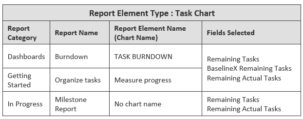
Note that the task chart in the
Milestone
Report report of
In Progress category
does not include the
BaselineX Remaining Tasks field.
When we open the
Field List pane on
any of the charts above, it shows all the fields
included in the chart (see the field names listed below
the Fields Selected column) as well as the common
settings applied to all the charts, as follows:
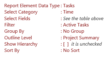
Note - Before drawing any
graphical reports, make sure that the project plan's
outline is fully expanded --
Based on these common default
settings, all the task burndown charts listed in the
table plot the line graphs of the selected fields’ data
stored in the task-timephased category against time at
the project summary level for the entire project. That
is, the total number of tasks on the vertical Y-axis are
plotted against time periods on the horizontal X-axis.
In this section, we will build a
custom task burndown chart in order to explore how both
the status and the schedule updates in a project plan in
the implementation phase are first reflected to the
three fields’ data (i.e.,
Remaining Tasks,
BaselineX Remaining Tasks and
Remaining Actual Tasks)
at the project summary level, and then in turn, to a
chart which visualizes the same data at the outline
level set to Project
Summary in the report.
We will also discuss how to
interpret the chart in order to determine the current
status of the project in three known scheduling
scenarios, and also in order to forecast how the team’s
future progress would be trending toward zero remaining
tasks based on their past performance. For this purpose,
as explained in the following paragraphs, let us first
create an example project and then a custom chart
plotting the line graphs of the fields in that project.
Important Note -- In order to
interpret the information presented by the
TASK BURNDOWN
chart, we first need to understand how MS Project
calculates the number-of-tasks data that the three
number-type task-timephased fields,
Remaining Tasks,
BaselineX Remaining
Tasks and
Remaining Actual Tasks hold at any summary
level in any specified time period of a project’s
timeline. It is recommended not to continue reading
if you have skipped the previous section that covers
all three fields in detail --
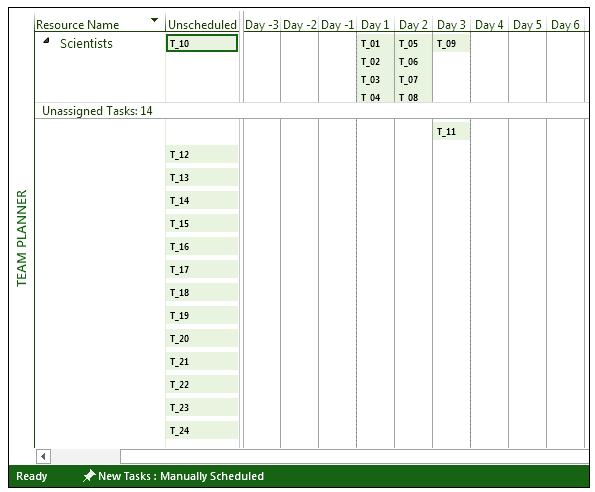
Suppose that we have a 24-task
research project and it has been estimated that a team
of scientists with similar skills, knowledge and
experience, which are full-time available, would
complete the project in six days, where each day’s task
list contains four one-day long tasks (or operations);
and all these high-tech tasks require the same amount of
mental/physical effort. The picture below shows the
stack of manually scheduled tasks in the
Team Planner view,
while daily list of tasks with no dependencies are still
being arranged and assigned to the resources by
drag-and-drop scheduling:
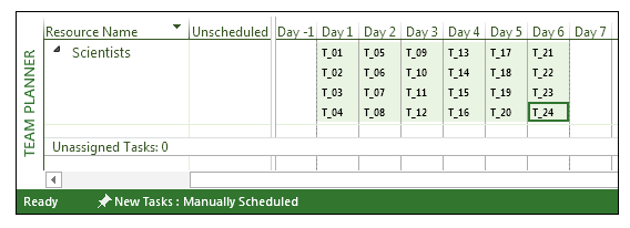
This is the final layout that
shows all 24 fixed-length tasks, distributed evenly over
the project’s duration, and assigned to the project
team:
In the following combination view
of the example project, the lower pane contains the
Task Usage view
while the upper pane shows the three fields’ line graphs
in the chart, just before the 24-task six-day demo
project has started:
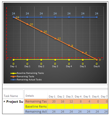
The chart plots the number of
tasks in the primary vertical axis (currently hidden)
against time periods as days in the primary horizontal
axis, where the orange line graph trending downward from
left to right represents the
Remaining Tasks
field, and where the horizontal yellow line graph at the
bottom with all 0s represents the
Baseline Remaining Tasks
field which contains no data yet, and finally where the
horizontal blue line graph at the top exhibits the
Remaining Actual Tasks
field which is filled with the total number of tasks in
the project in all periods (i.e., days), which is 24 at
this moment, since the project has not started yet. In
this demonstration, there won’t be any part of the line
graphs going flat because of non-working days since the
project calendar is the modified
Standard base
calendar with seven workdays a week.
Also see the red-colored and
dashed secondary vertical and horizontal axes inserted
to the chart; we will use them as a visual aid in order
to mark the status date (i.e., the end of the status
period) and the number of remaining actual tasks on the
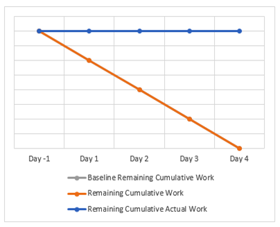
status date. For example, if the status period is Day 5
and the number of remaining actual tasks is 8, we will
manually adjust the horizontal red line such that
vertical axis crosses it at category number 7 (including
Day -1); that is, the start of Day 6 (i.e., the current
period); and similarly, we will manually adjust the
vertical red line such that horizontal axis crosses it
at the axis value 8.
· · ·
Suppose that we have now completed
planning the project and have just set a baseline before
the project starts. This is how the
Task Usage view’s
timephased table looks like in the project plan file
after having set the first baseline for the first time,
and how the chart in the report page shows the line
graphs of the three fields at the project summary level:
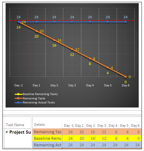
The
Remaining Tasks field’s orange line graph plots
the number of scheduled tasks that remain in the project
against the days. The
Remaining Tasks field’s data has already been
copied to the Baseline
Remaining Tasks field, therefore, the baseline
graph (yellow line) overlaps with, and is now behind the
remaining tasks graph (orange line). Note that the
default order of the field names in the legend from top
to bottom is the same as the order of the line graphs
from back to front in the chart and both are determined
by the order of the fields in the
Field List pane from
top to bottom.
We will now explore how the chart plots the fields’ line
graphs during the project execution, in three scheduling
scenarios that take place while tracking the team’s
progress in terms of the number of remaining tasks; that
is, team’s progress being on schedule, ahead of the
schedule and behind the schedule.
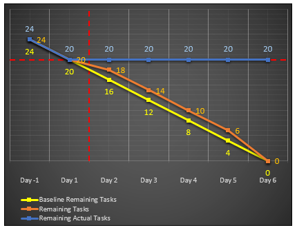
Scenario
1/3: Project on Track
According to our scenario, the
example project has now started and the status updates
will be done at the end of each day, as it was decided
in the planning phase. The project is now being
underway, suppose that, it has been reported that 20
tasks have actually remained to be completed in the
project at the end of Day 1 (i.e., the status period).
That is, all the scheduled tasks of that period (that
is, 4 tasks = 24 – 20) were completed, which means that
the project is on track with the estimated schedule. We
will first see how the chart plots the line graphs of
the fields for a project which is on schedule at the end
of a status period.
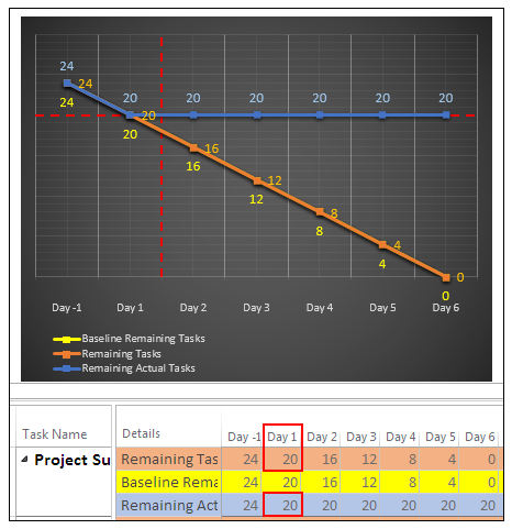
As it is seen in Day 1’s column in
the table, the Remaining
Actual Tasks field shows the same total number
(i.e., 20) as the Remaining
Tasks field at the project summary level after
the project schedule’s status has just been updated by
entering 100 to the
% Complete field for all four tasks of the status
period. Therefore, as it is seen in the chart of the
updated project schedule, the remaining actual tasks’
blue line graph merges with both the orange line graph
of the remaining tasks and the yellow line graph of the
baseline remaining tasks at the data point corresponding
to 20 tasks at the end of the status period. The blue
line graph stays horizontal at the current number of
remaining actual tasks (i.e., 20) in all the future
periods.
As demonstrated above, although
comparing the status period’s numbers displayed in the
task-timephased rows of the fields in the
Task Usage view
shows the project’s status after it has just been
updated according to the actual number of tasks reported
by the team (that is, entering 100 to the
% Complete field for
these tasks), it is a lot easier to see the current
status on the chart since it visualizes the difference
in the data as the vertical difference in the levels of
the data points on the line graphs of the fields in the
status period.
· · ·
In the previous paragraphs, we
have already updated the project schedule’s status. We
may also need to update the project schedule by
re-arranging the layout of the tasks at the end of a
status period. We will now see how such changes are
reflected to the line graphs of the fields in the chart.
Suppose that, at the end of the
status meeting, it has been decided to update the
project schedule as well, by shifting the work to be
performed on the two tasks from Day 2 to the last day of
the project. We can do it by either removing the
existing two tasks from Day 2’s task list and then
adding them to Day 6’s task list or moving them directly
by drag-and-drop scheduling. But the results would be
different as we will discuss how below:
The charts below shows the resulting line graphs:
At this
point, there are now 24 tasks in the project as
there was at the beginning, but the existing
Baseline Remaining
Tasks field which
starts at 22 tasks do not represent the current
total number and distribution of the remaining tasks
in the re-estimated project schedule, because of the
blank timephased rows of the
Baseline Remaining
Tasks field for the two
tasks added to the project schedule.
The
chart below shows that if the tasks were moved,
instead of deleting and then adding them, the
distribution of the numbers over time in between Day
2’s data point and the last data point would change
in the Remaining
Tasks field’s line
graph without affecting the
Baseline Remaining
Tasks field’s line
graph:
In the
chart above, comparing the
Baseline Remaining
Tasks field’s line
graph with that of the
Remaining Tasks
field shows us the changes that have occurred on the
distribution of the number of remaining tasks over
periods, which would otherwise be difficult to see
by reviewing the task-timephased numbers in the
Task Usage
view.
In either method above, unless the
baseline has been updated through the
Set Baseline dialog box
after the layout of the tasks was re-arranged, the
baseline remaining tasks’ line graph cannot be compared
with the remaining tasks’ line graph if changes in the
distribution of the number of remaining tasks occur in
the future status periods. This is the resulting chart
that plots the line graphs of the three fields after the
project’s status, schedule (by using either method), and
baseline, all have been updated:
Now the numbers in the
Baseline Remaining Tasks
field is the same as those in the
Remaining Tasks
field on the timephased table. We can now focus on the
tasks of the next period in the project.
Scenario
2/3: Project
Ahead of Schedule
Imagine a status period, where the
project team has actually completed more tasks than
scheduled by performing work on some future tasks; in
other words, the project has progressed ahead of the
schedule, and therefore, there are less tasks remaining
at the end of the status period than you had originally
scheduled. In order for the project schedule to reflect
the current project status as it has been reported by
the team, it should be updated by a two-step process;
firstly, moving those tasks from future period to the
status period, and then secondly, entering 100% for
their percentage of completion since there cannot be
tasks completed in future. The two charts below depict
the two-step update process, as also explained in detail
below:
-
Firstly, the project schedule
has been updated by moving three tasks from Day 3 to
Day 2 which is the status period, and therefore, the
number of scheduled tasks that remain in the project
is reduced from 18 to 15 at the data point of the
orange line graph, as it is seen below:
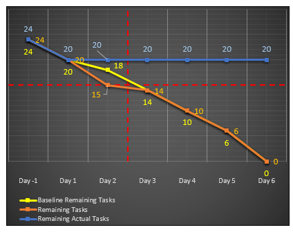
The section of the orange line
graph of the remaining tasks from Day 1 to Day 2 has
now become much steeper than that of the yellow line
graph of the baseline remaining tasks, since the
number of scheduled tasks that is re-estimated to
remain at the end of the status period (i.e., 15) is
less than that of the baseline schedule (i.e., 18).
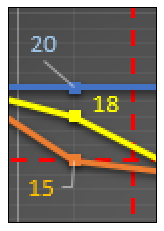
By looking at the data point
of the baseline graph in the status period, we can
see what the number of remaining tasks originally
was in that period, as it is seen in the enlarged
view below extracted from the chart after having
completed the first step of the update process in
this status period:
Since we should re-baseline
the project at the end of the update process, the
baseline graph will no longer show what the number
of remaining tasks originally was in that period.
But we rather focus on the number of scheduled tasks
that have actually remained to be completed in the
project at the end of a status period as it relates
to whether the team could be able to reach zero
tasks on the estimated finish date, therefore, we may decide
not to include the baseline graph in the chart,
although the baselines should, in any case, be
maintained in order to track variances to the other
data during the course of, not this example project,
but the real-life projects.
-
Secondly, the project
schedule’s status has been updated by entering 100
to the % Complete
field for all the tasks of this period, including
the ones just added (that is, 5 tasks in total = 20
– 15):
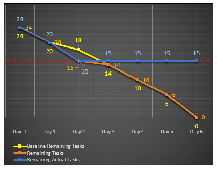
As the chart above shows, the
Remaining Actual Tasks
field’s graph has now merged with the
Remaining Tasks
field’s graph at the data point 15, which is the
number of scheduled tasks that have actually
remained in the project at the end of the status
period.
This is the chart of the final
schedule at the end of Day 2 after the baseline has been
updated as well:
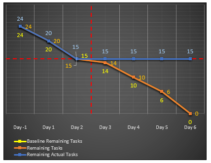
More tasks have been completed in this period than it
was originally planned scheduled, and
as a result, there are now 15 tasks left to be completed
in the project at the end of the status period.
Note -- The graphical reports
differ from the text reports of earlier versions and
the visual reports in that all the elements in a
report page are automatically updated as soon as the
associated project data change. In other words, they
are dynamic, therefore you do not need to generate
the report again when the project data it displays
change. As an example, just follow the steps in
either method described below, in order to see a
live version of how the graph changes while updating
the project schedule:
Method 1: Using a Combination
View
-
In the active task view, check
the Details box
in the Split View group
on the View tab
and select Gantt Chart
from the dropdown, in order to open a combination
view with the Gantt
Chart view on the bottom pane.
-
Open the custom burndown
report that we have been developing by using the
Reports dialog
box; MS Project will display the report on the top
pane, while the Gantt
Chart view is on the bottom pane. Note that
MS Project always opens the report views on the top
pane (like the timelines), even when the focus has
been currently set to the bottom pane.
-
Now set the details view
(i.e., the bottom pane) to the
Team Planner.
Right-click on Day 3’s task and then MS Project will
redraw the remaining actual tasks graph in the
report on the top pane as soon as you have selected
100% button on the shortcut menu displayed.
Method 2: Opening a new view
window to update the schedule
-
While the active view is the
report view, click <Shift+F11> on the keyboard to
open a new window; MS Project opens a new window
with the default view, which is
Gantt with Timeline.
-
Double-click the horizontal
view separator bar, when the cursor changes to this
 over
the separator, to close the
Timeline view
(you can also use the menu commands –
View |
uncheck [ ]
Timeline); and then right-click the vertical
active view bar and select the
Team Planner on
the shortcut menu displayed. over
the separator, to close the
Timeline view
(you can also use the menu commands –
View |
uncheck [ ]
Timeline); and then right-click the vertical
active view bar and select the
Team Planner on
the shortcut menu displayed.
-
When the active view is the
Team Planner
view, click the Restore Down
button in the upper-right hand corner of the
Team Planner
window ( );
then move and resize the restored-down window to a
manageable size smaller than the full screen so that
you can see the report view behind it. That would be
resulting screen: );
then move and resize the restored-down window to a
manageable size smaller than the full screen so that
you can see the report view behind it. That would be
resulting screen:
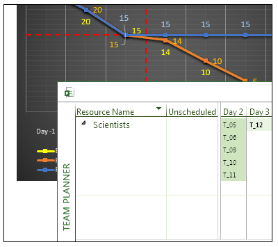
-
Now right-click on Day 3’s
task and select 100% button on the shortcut menu
displayed. As soon as you have completed the entry,
you will see that the blue line graph’s data point
lowers from 15 to 14 on the chart behind. Click the
Maximize button in the
upper-right hand corner of the restored-down
Team Planner
window ( )
if you want to continue to work on the tasks in the
full screen. )
if you want to continue to work on the tasks in the
full screen.
While a view’s window is in
fullscreen, you can switch to the other views’
windows open in the background by using either MS
Project’s Taskbar button or the
Switch Windows
button in the Window
group of the View
tab. Title bar of each restored-down window shows a
label in the format
filename : number.
MS Project’s title bar shows the same title as the
window in the full screen at the moment. When all
the views are in restored-down windows, MS Project’s
title bar shows the product name. MS Project’s
filename-number convention helps us while navigating
from one window to another. While working with
multiple windows, the
Arrange All button in the Window group of the
View tab shows
all the windows at once by arranging them
horizontally --
Scenario
3/3: Project
Behind Schedule
Now let us see how the
chart would look like when some of the scheduled tasks
in a status period were not completed. Day 3’s task was
completed as scheduled. As the chart below displays at
the data point of the line graph for the
Remaining Tasks
field, 10 scheduled tasks should have remained in the
project at the end of Day 4 (i.e., the status period):
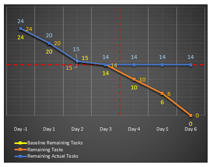
But the team now reports
that the number of remaining actual tasks is 12, instead
of 10, at the end of Day 4. At this point, we know that
the project is behind the schedule since 12 tasks have
actually remained, instead of 10. In other words, the
team should have completed four scheduled tasks in this
period (4 tasks = 14 - 10), but they were able to
complete only two of them. We are now going to update
the project schedule with the status information
reported (i.e., entering 100 to the
% Complete field for
the two tasks) and then see how the chart shows the
current status of project as being behind the
schedule. The chart below shows the current status of a
project, whose schedule has just been updated with the
actuals collected during the status period:
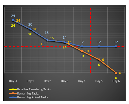
The chart demonstrates a
common scenario that occurs when there are still some
incomplete tasks at the end of the day on the status
date. Therefore, at the end of Day 4, the
Remaining Actual Tasks
field’s line graph does not overlap with the
Remaining Tasks
field’s line graph. In other words, they do not merge at
a common data point since incomplete tasks exist in the
project at the end of the status period. By looking at
the number of tasks (the y-axis values) displayed at the
data points of the line graphs in the status period, we
can clearly see that there are more remaining actual
tasks (see the blue data label 12) than the remaining
scheduled tasks in the current schedule (see the orange
data label 10). The
Remaining Actual Tasks field’s horizontal part
would have started at 10, instead of 12, if all the
scheduled tasks in the last period were finished.
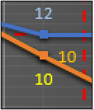
If there were no data
labels, we could have easily concluded that
the team’s progress was behind the schedule in
the status period, by simply looking at how the
Remaining Actual Tasks
field’s blue line graph is trending toward the data
point, which is being less steep than that of the
Remaining Tasks
field’s line graph in the last period. But note that
this view is temporary since the project schedule must
also be updated, as will be discussed below, for the two
uncompleted tasks of this period.
As mentioned above, a
schedule status update which results in the number of
remaining actual tasks being greater than the number of
remaining tasks at the end of a status period usually
requires further update in the project schedule, such as
re-planning re-scheduling the future
work. According to our scenario, at the end of the
status meeting, it has been decided to move the two
incomplete tasks (2 = 12 - 10), or to split the
uncompleted parts of these tasks to the next day or
further ahead in the project schedule (Team
Planner view can be used to do drag-and-drop
moving/splitting of tasks with the percentage of
completion less than 100%). Here, the total number of
tasks in the project remains unchanged, while the
distribution of the number of scheduled tasks remaining
over time changes in the future periods. And MS Project
redraws the Remaining Tasks
field’s line graph in the chart based on the new
distribution of the numbers. This is how the resulting
chart looks like when the remaining two tasks of the
status period have been moved to the next day in the
project; in other words, the chart after both the status
and the schedule of the project have been updated at the
end of the status period:
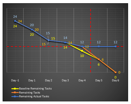
The line graphs of both
the Remaining Tasks
and Remaining Actual Tasks
fields have now merged at a common data point in the
period of the x-axis on the chart corresponding to Day
4; this time the orange line has merged with the blue
one, at 12; thus, the data point of the blue line graph
stays where it was. As a result, how the team’s progress
was in that past period (i.e., Day 4) can no longer be
determined by visually comparing both data points.
· · ·
As soon as we re-baseline the
project, the baseline remaining tasks graph will overlap
with the remaining tasks graph. Before doing that, we
can see how the project schedule was updated in that
previous period by comparing the numbers of both fields
in the timephased table or their data points in the
chart, or by visually comparing the steepness of the
remaining tasks graph with that of the baseline
remaining tasks graph in the chart, as elaborated below:
-
Day 5 is the current period
now, so the chart shows the status of the project as
of Day 4 which is the previous period. The data
point of the Baseline
Remaining Tasks field’s line graph in Day 4
is at 10. The number of baseline remaining tasks
being less than the current number of remaining
tasks tells us that the number of scheduled tasks in
the previous period was reduced by 2, but the number
of tasks in the project has remained unchanged as it
is obvious from the baseline’s data point in Day -1
which is still at 24. The difference in the numbers
can also be seen in the timephased table below:
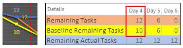
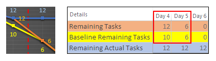
Comparing the numbers in Day 4
and Day 5 shows that moving the two incomplete tasks
from Day 4 to Day 5 has changed the project schedule
so that the orange line now becomes more steep
downward to Day 5 than the baseline’s yellow line,
since there are now more scheduled tasks to be
completed in the current period (i.e., Day 5) than
there were before the modification.
Let us re-baseline the project
now. Having completed all the updates in the project
schedule at the end of the status period, this is how
the resulting chart looks like:
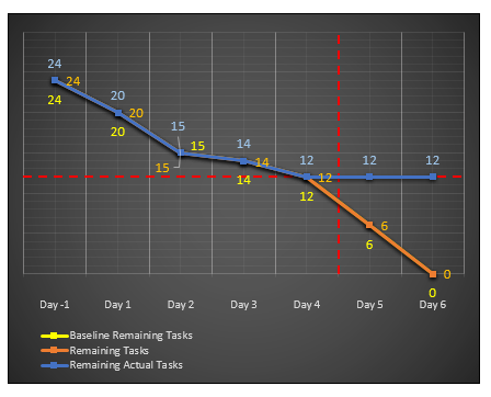
At this point, the chart shows us the number of
scheduled tasks that have remained to be completed in
the project as of the last status period, and how the
number of remaining tasks are distributed over the
future periods. It also shows how the estimated progress
would be trending toward zero tasks through the future
periods; thus, the remaining tasks’ line graph declining
from Day 4 to Day 6 more steeply than before indicates
that the team might not be able to reach zero tasks on
the estimated finish date since there are now more
scheduled tasks to be completed than it was initially
estimated (see below).
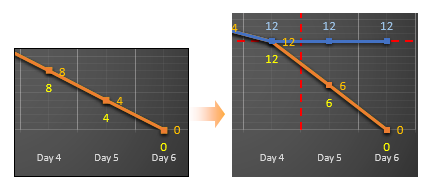
Adding a Trendline to the Chart
Let us go back to the initial
chart with the line graphs of the two fields when the
project has not started yet. At that time, since the
tasks in the example project were evenly distributed
over time in the estimated schedule, the
Remaining Tasks
field’s line graph was a straight line with a uniform
downward steepness from left to right. And therefore,
the ratio of the vertical change on the y-axis to the
horizontal change on the x-axis (also referred to as
ratio of fall to run) was the same between any two
successive data points on the line graph. This ratio is
the slope (or the gradient) of the orange line of the
remaining tasks, as it is shown below:
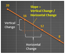
The magnitude of the absolute
slope value indicates how steep the line is. Thus, in a
period, the larger the slope of the line gets, the
steeper the line becomes, the more the number of
remaining tasks decreases in that period. Consider the
two successive data points on the remaining tasks’ line
graph below (see the information manually added to the
chart below by inserting shapes, such as text boxes,
lines and basic shapes), which are designated by their
x- and y-coordinates (i.e., a day number from the x-axis
and the corresponding number of remaining tasks from the
y-axis); that is, (2, 16) and (3, 12).
The vertical change between these
two data points is -4 (=12-16), while the horizontal
change between the same two data points is one day
(=3-2), or simply one time period, as shown in the
chart. Thus, the ratio being equal to -4 (=-4 / 1), the
line falls from left to right with a negative uniform
slope of -4. In other words, the line graph represents
four-task decrease per period. Since we already have the
slope value now, we can write the ratio between, say,
Day 2’s data point (2, 16) and any data point with
coordinates (x, y) on the line graph, as follows:
-4 = ( y – 16 ) / ( x – 2 )
The equation above can be written
as y = -4x + 24, where 24 is the y-intercept of
the line graph at which the remaining tasks’ line graph
crosses the y-axis; that is, the total number of tasks
in the project in Day 0 (i.e., the data point (0, 24)).
This linear equation of the line
in the form of slope-intercept can be used to calculate
(i.e., interpolate) any data point on the remaining
tasks’ line graph plotted by using the existing data
from the estimated schedule. For example, just to see
how it works, let us find the time period, or day on
which the team is estimated to reach zero tasks (i.e.,
x-intercept), which is already known, as follows:
substitute 0 for y in the equation above, as in 0 =
-4x + 24 and then solve it for x as in x = -24 /
-4 = 6. The result is the sixth period, or Day 6 as
it is seen in the chart (i.e., the data point (6, 0)).
Although there would be no useful
purpose in adding a trendline to a complete line graph
plotting the estimated data, it may prove to be useful
in exploring how the trendline feature works, so let us
now add a linear trendline (also referred to as line of
best fit) to the chart, based on the same data series
used to plot the remaining tasks’ line graph, as
follows:
On the menu, click
Trendline,
select Remaining Tasks
on the Add Trendline
dialog box displayed, click
OK to close the
dialog box. This action will by default add a linear
trendline to the remaining tasks’ line graph.
Next time you open the
CHART ELEMENTS
menu, you will see that the
Trendline
checkbox has already been selected. At that time,
you can click it again to deselect the checkbox
(i.e., to remove the trendline) or click the right
arrow for the other options.
-
Next, right-click the
trendline that has been just added to the chart and
select Format Trendline
on the menu displayed to open the
Format Trendline
pane. Note that there are no labels on the tabs of
the pane, but MS Project shows a label screentip
when you hover the mouse pointer over the tab’s
icon.
On the
Fill & Line tab,
change the Dash type
and Color so as
to make the trendline easy to see on top of the
remaining tasks’ line graph.
On the
Trendline Options
tab, turn on the associated checkboxes to display
the equation and r-squared value of the trendline on
the chart.
This is the resulting chart
with the trendline:
As getting into the details on how
the calculations are performed on the background is out
of scope of this discussion, it suffices to say that the
chart uses the least-squares regression method to draw
the linear trendline that fits best through the data
points of the remaining tasks’ line graph. As it is seen
above, it overlaps with the remaining tasks’ line graph,
in other words, it passes through all the data points of
the remaining tasks’ line graph, since they are all
aligned with each other on a line of uniform negative
slope. Therefore, as we would expect, the trendline has
the same linear equation as the one that we have already
derived manually for the remaining tasks’ line graph in
the previous paragraphs. Thus, the trendline’s equation
can be used to predict (i.e., interpolate) the number of
remaining tasks at any period, which is not available in
the existing data series; for example, the number of
remaining tasks in the 4.5th period would be
6 (= -4 * (4.5) + 24).
Although we can easily see a
perfect fit of the trendline to the data points visually
on the chart in this demonstration, we need to check the
trendline’s r-squared value (also referred to as the
coefficient of determination), which is a value between
0 and 1, both inclusive, in order to determine how well
the trendline fits the data points. The closer the
r‑squared value is to 1, the better the trendline fits
the data points, the more reliable the trendline
becomes. Since here, as we would expect, the r-squared
value is 1, we can conclude that the trendline is
reliable, and therefore, the relationship between the
number of remaining tasks and the project time spent can
be explained by the linear regression model represented
by the trendline, and thus, by the linear equation
y = ‑4x + 24. On the other hand, if the r‑squared value
is 0, it would simply indicate that the data points do
not fit a linear model.
In the next section, we will discuss how to use the
trendline feature in order to forecast the progress (or
the number of remaining actual tasks) in the future
periods, during the project’s execution.
Forecasting Progress by Using a Trendline
In the example project, the
remaining tasks’ line graph with a uniform slope of -4
were representing an ideal daily progress according to
the estimated project plan, which has been initially
developed based on the expectation that the team would
be able to maintain a steady pace of completing
four-tasks per period throughout the project. Because of
re-estimations and updates to the schedule as the
project progresses, the
Remaining Tasks field’s numbers have changed, so
its line graph based on the re-estimated schedule has a
larger negative slope now in the future periods than
before. It had been initially estimated that eight
scheduled tasks (i.e., the number of remaining tasks)
should have remained at the end of the fourth period
(i.e., Day 4), but 12 tasks (i.e., the number of
remaining actual tasks) have actually remained at the
end of Day 4.
The team is now expected to
complete the remaining 12 tasks in Day 5 and Day 6,
according to the remaining tasks’ line graph based on
the re-estimated schedule, as it is seen on the second
chart above.
Now getting back to where we left
off with the example project, suppose that the team has
already started off working on the tasks of the current
period, Day 5. As the project is getting closer to Day
6, which was estimated to be the last period, we are now
going to add a trendline to the
Remaining Actual Tasks
field’s line graph and extend it forward into the future
in order to forecast the team’s progress in future
periods so as to see when the team might be able to
reach zero tasks. So the steps below describes how to
create a copy of the chart firstly and then to add a
trendline (just in case, create a backup copy of the
original project plan file before starting):
Creating a Copy of the Chart
-
It is best to keep the
original chart as it was, so create a copy of it to
work on in the same report page. Thus, you can
simply delete the new chart, instead of undoing all
the steps, when you want to revert to the original
chart.
To copy the chart; click the
chart to select it and begin dragging it slightly,
and at that moment, press and hold <Ctrl> (also
press and hold <Shift> at the same time, if you want
to align the copy to the original chart horizontally
or vertically, depending on the direction of
dragging). The cursor with a plus sign and a ghost
image of the copy will guide you throughout the
process until you position and drop the copy of the
chart to a location that you want in the report
page.
Here are the other two methods
to create a copy of the chart:
Right-click the chart, select
Copy on the
shortcut-menu opened, and right‑click again to
display the menu and select
Paste to create
a copy. Then position the copy anywhere you want in
the report page by drag‑and‑dropping it.
Right-click and at the same
time drag the ghost image of the chart displayed to
the location you want and drop it; select
Copy on the
small menu displayed (see below):
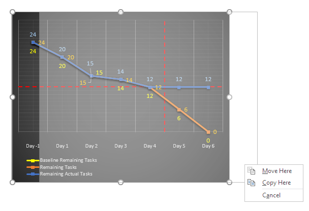
Now you can work on the copy
just created. It is also possible to work on a copy
of the project plan file (i.e., the mpp file) but we
want to keep the original chart at sight in order to
make a visual comparison. All the steps from that
point on will be performed on the copy of the chart
in the same report page.
Adding a Linear Trendline
In the
Field List pane,
click Edit in
Select Category
section to edit the time range for the x-axis; add
one day to the start date to exclude Day -1, and
subtract two days from the finish date to exclude
the last two days. These settings will be applied to
all the line graphs on the chart.
While in the pane, since we no
longer need it, remove the
Baseline Remaining
Tasks field from the chart by right-clicking
it and selecting Remove
Field on the menu opened in the
Select Fields
section.
This would be the resulting chart:
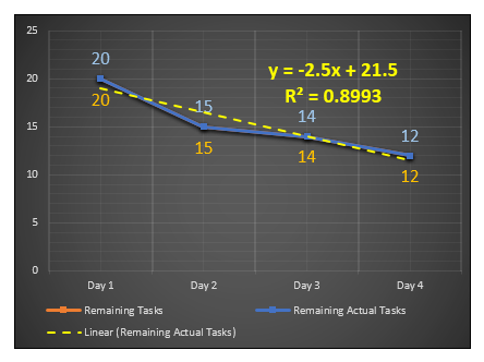
The chart draws a linear trendline
that fits the existing data points of the remaining
actual tasks’ line graph and displays its equation in
the linear slope-intercept form as y=-2.5x + 21.5.
Thus, the trendline simply indicates that if the team
continues to work at their current pace, they might
reach zero tasks within Day 9, since the trendline
intercepts the time axis at 8.6 (=21.5/2.5, if y = 0).
In other words, the trendline calculates by
extrapolating that the team might need 2.6 days (= 8.6 –
6) more than estimated in order to reach zero tasks.
Time axis on the chart now shows 4
periods since its range has been limited by the time
category settings, so extending the forecast period of
the trendline by entering 4.6 as the period value
(=8.6-4) to the Forward
box in the Format Trendline
pane enables us to see where the trendline intercepts
the x‑axis; the coordinate of the intercept point is
(8.6, 0) in Day 9; or zero tasks on the 8.6th
period; see below:
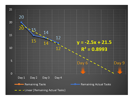
In this example, the linear
trendline’s r-squared value is calculated to be 0.8993
since we have adjusted the actual data points in order
to demonstrate a fluctuating progress. If the alignment
of the data points of the remaining actual tasks had
been adjusted so as to resemble a line, the resulting
trendline would fit the actual data points well, and its
r‑squared value would be much closer to 1 than 0.8993.
As mentioned before, the larger the r-squared value, the
better the team’s past progress fits the linear model
represented by the trendline, thus the more reliable the
trendline becomes.
Although, in a real-life project,
a trendline with the r-squared value of 0.8993 might be
considered a reliable one, depending on the actual
scenario behind the numbers, it obviously indicates that
the project time spent was not the only variable that
has determined how the number of remaining actual tasks
has decreased over time so far.
Let us discuss some scenarios
after having added trendline. Suppose that you, as the
project manager, do not consider the forecast result
reliable, and you believe that the trendline would have
been steeper than the current one, if some unexpected
events occurred in the previous periods had not affected
the team’s performance adversely. And also having
considered some other qualitative factors which had
slowed the team’s progress down in the previous periods,
you may predict that the actual progress of the team in
the next two periods would be better than the
trendline’s forecast since such events might not occur
again and these factors no longer exist in the project
environment; in other words, you think the team would
succeed to reach zero tasks on the estimated finish
date, despite the forecast on the chart, so there is no
need to take any corrective/preventive actions at the
moment.
As an alternative scenario, having
already got the forecast from the chart, you, as the
project manager, may consider revising the date on which
the progress was estimated to reach zero tasks (for
example, push it back one day), and at the same time,
taking some actions for speeding progress, for example,
adding resources to the project, in order to ensure that
the remaining 12 tasks would be completed as scheduled.
Also in a similar real-life
project, the number of remaining actual tasks would not
decrease linearly as the project duration consumed by
the team increases during the project’s execution, since
the team’s actual progress would most likely fluctuate
because of various factors that might affect the team’s
work and performance. Even if the team manages to work
at a steady rate such that the actual data points
resemble a line for the past periods, regardless of how
reliable the trendline seems to be (or regardless of how
well the actual data points fit the linear model), it
would be unrealistic to make decisions based on the
future progress of the team predicted by using the
forecast information derived from a line of best fit (or
another model available to choose from the options). It
is a statistical tool as its results do not account for
team dynamics and qualitative factors that would affect
the team’s actual progress in future. On the other hand,
a linear trendline may serve as a motivational tool in
status meetings of similar small projects where teams
are required to maintain a steady pace in completing the
tasks throughout the projects.
Note -- Here, the content on
using the trendlines has been provided only for
demonstrating the feature, as a discussion on
selection and implementation of forecasting methods
or regression models is out of scope of this content
--
Forecasting Progress by Using a Trendline - Using Visual
Reports
Visual Reports feature can be used
to generate a chart that plots line graphs of both
fields, the Remaining Tasks
and the Remaining Actual
Tasks, against time, and then a trendline added
to the Remaining Actual
Tasks field’s line graph can be used to forecast
whether or not the team might reach zero tasks on the
estimated finish date based on their past performance as
of status period. So, follow the steps below to first
create an MS Excel template for this purpose:
-
Open the example project plan
file, updated as of Day 4.
-
Click
Visual Reports
on the Report
tab to open the dialog box
Visual Reports - Create
Report; here, select <Days> for
Select level of usage
data to include in the report,
then click New
Template which will open a dialog box for the
new template.
-
In the
Visual Reports - New
Template dialog box, choose
Excel as the
application and Task
Usage as the data type and click
Field Picker
which will open a dialog box.
-
In the dialog box
Visual Reports - Field
Picker, click
Remove All to remove all the fields currently
selected in the
Selected Fields box.
-
In the
Available Fields
box, select the fields
Remaining Tasks and
Remaining Actual Tasks
field and click Add
to insert them into the
Selected Fields box.
-
Click
OK to close this
dialog box and then click
OK again to
close the Visual
Reports - New Template dialog box.
MS Project will now start to
create the MS Excel template. MS Excel will open a
workbook with a sheet containing a pivot table as soon
as MS Project completes generating the template.
-
In MS Excel sheet, to hide the
row and column totals that we do not need,
right-click the pivot table and select
PivotTable Options;
uncheck both boxes in the
Grand Totals
section of the Totals &
Filters tab and click
OK to close the
dialog box.
-
Next, arrange the fields in
the PivotTable Fields
pane and insert a chart plotting line graphs of both
fields, and then add a trendline displaying equation
to the Remaining Actual
Tasks
field’s line graph (right-click the line graph,
select Add Trendline
on the menu displayed, and check the box
Display Equation on
chart in Format
Trendline pane).
The resulting PivotTable and
PivotChart for the example project will look like this:
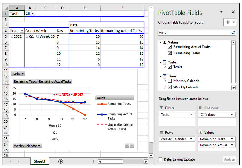
-
Rename the sheet as <Task
Usage> and right-click the chart and move it to a
new sheet by selecting
Move Chart on the menu; change Chart1 to
<Remaining Tasks> in the dialog box and click
OK.
-
Now save this workbook as a
template with any name you want, for example,
<Forecast_Zero_Tasks>, to any directory (or to the
default templates directory), in order to use it
later in other projects. Clear the data before
saving the template. Close and exit MS Excel.
Now open the new template through
Visual Reports, modify it and continue to work in the
example project, as follows:
-
The
Visual Reports - Create
Report dialog box should be still open in MS
Project. Now check the box
Include report
templates from and click
Modify to select
the templates directory that contains
<Forecast_Zero_Tasks>. Click
OK to close the
Modify Location
dialog box.
-
Select the template
<Forecast_Zero_Tasks> that has already been included
in the Task Usage
tab of the Visual
Reports - Create Report dialog box, select
<Days> for Select level
of usage data to include in the report and
click View.
-
MS Project will now create a
report based on the template with the name
Forecast_Zero_Tasks1.
-
We need to modify the data
series used to plot the
Remaining Actual Tasks field’s line graph for
excluding the values of both Day 5 and Day 6,
otherwise the trendline won’t be accurate, since we
do not have actual numbers for these days yet. For
this purpose, we need to unlink the chart from the
pivot table by copying it. Right-click the chart,
select Copy on
the menu opened, paste it into a blank workbook.
-
Close the template
Forecast_Zero_Tasks1 since we no longer need it.
-
In the new workbook, click the
Remaining Actual Tasks
field’s line graph on the chart and remove the last
two data (i.e., 12 and 12) from the data series
displayed in Formula
Bar. Also change the time labels containing
year, quarter, week and day number to just day
numbers by typing in. Hit <Enter> to apply the
changes.
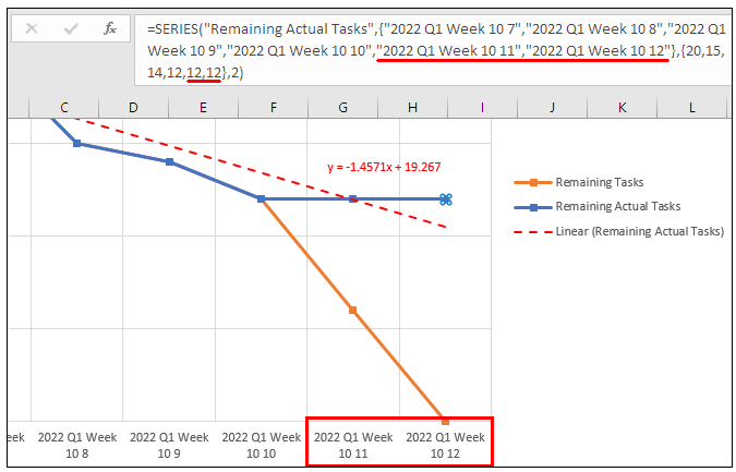
-
The trendline equation now
becomes y = -2.5x
+ 21.5. Substituting 0 for y and solving
the equation for x, gives the x-intercept as 8.6 (=
21.5/2.5), which means the team reaches zero tasks
on 8.6th period (or day) instead of 6,
according to their performance in the previous
periods.
-
The chart uses the existing
four data points to plot the trendline. Typing in
4.6 (= 8.6 – 4) to the
Forward box in the
Forecast section
of Format Trendline
pane (right-click the trendline to open it) extends
the forecast by 4.6 periods so that the trendline
reaches x-intercept.
We can now easily see the
difference on the chart. As a result, the team might not
be able to complete the project on Day 6. See the
resulting chart below:
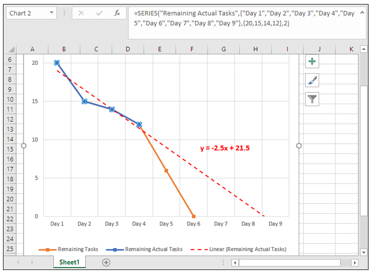
Alternatively, instead of copying
the chart to a new workbook, a copy of the pivot table
data can also be used for plotting the chart with
emptied cells of Day 5 and Day 6 on the remaining actual
tasks’ column; that is, deleting 12s on the 11th
and 12th of 10th week, as
elaborated below:
Finally, the following is a quick
and simple method to transfer the numbers from the
timescaled table of the
Task Usage view to an MS Excel sheet:
-
Select the cells holding the
timephased data and click the
Copy button on
the Task tab’s
Clipboard group
or just hit <Ctrl> + <C> on the keyboard. Note that
you must pay extra attention not to select the wrong
cells.
-
Then paste the numbers into
the MS Excel sheet.
If you choose to use this
method, you need to do some additional work, such as
manually entering the timescale days and the field
names to the MS Excel sheet in order to create a
table for the data.
-
Arrange the data copied into
the new sheet as a table; replace the day numbers
with labels and delete the numbers below the future
periods, Day 5 and Day 6 in the
Remaining Actual Tasks
row.
-
Select the table and click the
Insert a line chart
button on the Insert
tab. MS Excel will insert a line chart to the sheet.
-
Add a trendline to the
Remaining Actual Tasks
field’s line graph as described before, but
this time, enter 2.6 period, instead of 4.6, to the
Forward box in
the Forecast
section in order to see where the trendline
intercepts the time axis, as it is seen below:
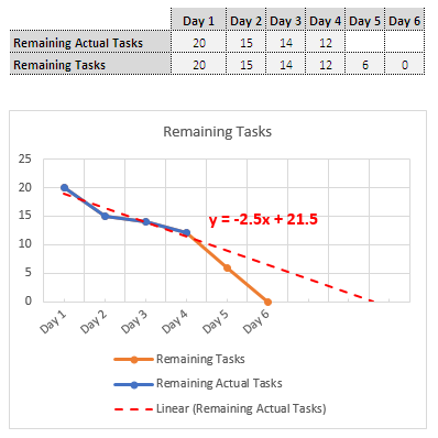
As you know,
MS Excel has some statistical functions that can be used
to calculate x-intercept of the trendline (i.e., the
period where the progress reaches zero tasks) and to
calculate the values at any data point on the trendline,
as well as its slope.
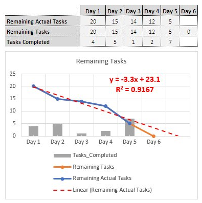
The bars for the number of tasks
completed on each day have been added to the chart
above. Although it may not be related to the team’s
performance, the progress rate fluctuates a lot from
period to period, as it is seen on the bar chart. Now
the forecast has been pushed back to Day 7 (i.e., 7th
period = -23.1 / -3.3).
Note -- As included in the
Office family of products, MS Project has similar
graphical report elements with both MS Excel and MS
Access, therefore, you can locate and read the
topics, such as “Add a trend or
moving average line to a chart” and “Choosing
the best trendline for your data” in
the support website in order to have more
information on using the trendline feature --
Completing the Project
Now it is the end of the Day 5, the
current period, the team has reported that they
successfully completed 7 scheduled tasks, including a
task from the next period, so that the number of
remaining actual tasks is now 5, as it is seen below:
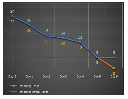
In Day 6, the team completes the
remaining 5 tasks, thus, the project ends.
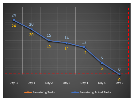
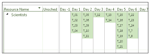
As it is seen above, in the
Team Planner
view of the completed project, tasks in the actual task
layout have not been distributed evenly over days like
they were in the estimated task layout at the beginning
of the project.
Calculating
Additional Number-of-Tasks Data by Using Custom Field
Formulas
In this section, we will develop
several task custom field formulas that will produce
some additional information related to the number of
tasks at project summary level. This information
produced at the project summary level may help us
further with interpreting the visual status information
presented by the chart. The formula results will be
displayed in task tables inserted to the report page of
the chart.
Label:
STATUS DATE
Formula:
"Day " & Int( [Status
Date] ) - Int( [Project Start] ) + 1
In the
Custom Fields
dialog box, select Use
formula in the section
Calculation for task
and group summary rows. Instead of the
formula above, the status date can be directly
displayed in the chart by using a formula in
Text30 such as,
ProjDateConv( [Status
Date], pjDate_mmm_dd_yyy)
Then the date format of the
time category on the horizontal axis should also be
changed accordingly to match the status date’s date
format.
In a project, where the status
updates are done weekly (i.e., performed at the end
of each week), and where the time category of the
chart is set to show the relative week numbers from
the project start, a different formula can be
utilized to display the relative week number
corresponding to the status date as follows,
provided that the week starts on Monday in the
current project plan file:
“Week ” & 1 + DateDiff(
“ww”, [Project Start], [Status Date], pjMonday)
Label:
TOTAL TASKS
Formula:
1 (enter 1
into Number1’s
formula box)
Calculation for task and group summary rows =
Rollup: Sum
Note that the project level
custom field Task Count
gives the total number of tasks in the entire
project, including the summary tasks, except for the
project summary task.
Label:
COMPLETED
Formula:
iif( [% Complete] =
100, 1, 0 )
Calculation for task and group summary rows =
Rollup: Sum
Label:
UNCOMPLETED or
use %C<100
as label, where %C represents Percentage of
Completion.
Formula:
iif( [% Complete] <
100, 1, 0 )
Calculation for task and group summary rows =
Rollup: Sum
The formula below also
calculates the number of uncompleted tasks
indirectly by subtracting the number of completed
tasks from the total number:
iif( [ID] = 0 OR
[Summary], [Number1] – [Number2], 0 )
Calculation for task and group summary rows =
Use formula
Number4’s
intermediate formula:
iif( [Finish] <=
[Status Date], 1, 0 )
Calculation for
task and group summary rows =
Rollup: Sum
Number4’s
formula calculates the total number of the tasks
that have been scheduled to finish on or before
the status date, at any summary level. Thus, at
the project summary level, subtracting this
number from the total number of tasks in the
project yields the number of remaining tasks in
the project as of the status date, as follows:
Number5’s formula:
Label:
REMAINING TASKS
Formula:
iif( [ID] = 0 OR
[Summary], [Number1] – [Number4], 0 )
Calculation for task and group summary rows =
Use formula
This
formula returns the same number to the custom
number field as the value that the
Remaining Tasks
field calculates in the period (i.e., days in this
example) corresponding to the status date in the
timephased table for any summary tasks or the
project summary task.
Number6’s
intermediate formula:
iif( [Finish] <=
[Status Date] AND [% Complete] = 100, 1, 0 )
Calculation for
task and group summary rows: Rollup: Sum
Number6’s
formula calculates the total number of the tasks
that have been completed on or before the status
date, at any summary level. Thus, at the project
summary level, subtracting this number from the
total number of tasks in the project yields the
number of remaining actual tasks in the project
as of the status date, as follows:
Number7’s formula:
Label:
REMAINING ACTUAL TASKS
Formula:
iif( [ID] = 0 OR
[Summary], [Number1] – [Number6], 0 )
Calculation for task and group summary rows: Use
formula
This formula returns the same
number to the table as the value that the
Remaining Actual Tasks
field calculates in the period (or day)
corresponding to the status date in the timephased
table for any summary tasks or the project summary
task.
The chart below shows each formula
result displayed in an individual small task table
inserted to the report page for the schedule that has not been updated
yet at the end of the status date:
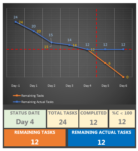
Note -- When you save the
project plan file and exit MS Project while viewing
the report, and then open the mpp file again, MS
Project will start the file with the last view, that
is, the report page. At that moment, the formula
results may be displayed as
#ERROR in the
chart, and hitting <F9> does not refresh the
results. In this case, change view, for example, to
the Gantt Chart view,
and refresh the formula fields by hitting <F9> and
then go back to the report page. The same action can
also be applied in the lower pane of the combination
view (i.e., Report view and
Task Usage view
combination) that we have used in the
demonstrations. Then you will see that all
#ERRORs have
already been replaced with the calculated data --
At this point, there are two task
status scenarios that we need to discuss regarding use
of the number of remaining actual tasks: tasks with
actuals in the future and incomplete tasks in the past,
as of the status date.
Future
Tasks with Progress
Although, in our example
project, tasks are grouped in the form of to-do
lists without sequencing, updating a future task
with progress information, say in Day 6, by
entering a value to the
% Complete
field, while we are still, say in Day 4, would
be out-of-sequence updating.
If there are tasks
completed in future periods, in the remaining
actual tasks’ line graph, the change in the
label values where the line does not continue
horizontal will reveal such tasks. Both in the
Task Usage
view and in the chart, as we would expect, the
field’s project summary level value in the
status period will not exclude the tasks
completed in future. Also note that the future
tasks with partial progress will be completely
invisible both in the table and the chart.
Number7’s
formula (REMAINING
ACTUAL TASKS) will demonstrate the
same behavior.
Suppose that you, as a
consultant, are reviewing a project schedule
that has been updated not by you, but by the
project manager at the PM office. If you want to
check whether there are any tasks with actuals
after the status date, the formula below would
help you to quickly see such tasks:
Number 8’s
formula:
Label:
TASKS IN FUTURE WITH
ACTUALS
Formula:
( [Actual Start]<>ProjDateValue("NA")
AND [Stop] > [Status Date] ) * -1
Calculation for
task and group summary rows: Rollup: Sum
The formula finds the
future tasks in progress or completed,
in-progress tasks crossing the status date
(tasks ahead of schedule
 ) and the future tasks that have actual start
date but no progress (% Complete = 0). If the custom number
field with this formula in a task table or the
table that displays the result of the formula in
the chart does not show 0 at the project summary
level, then you can check the schedule for the
future tasks with progress and decide on how to
deal with them.
) and the future tasks that have actual start
date but no progress (% Complete = 0). If the custom number
field with this formula in a task table or the
table that displays the result of the formula in
the chart does not show 0 at the project summary
level, then you can check the schedule for the
future tasks with progress and decide on how to
deal with them.
Let us now add
Number8’s
formula (TASKS IN
FUTURE WITH ACTUALS) to the report
page and update Day 6’s tasks as follows: enter
the values 90 and 100 to the
% Complete
fields of two tasks, and copy the
Start field
to the Actual Start
field in a task with 0% progress. This is how
the chart and the numbers look like now (the red
pointers were added to the picture manually):
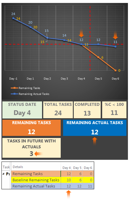
Incomplete Tasks in
the Past
If there are incomplete
tasks prior to the status date in a project
schedule, both the number returned by
Number7’s
formula (REMAINING
ACTUAL TASKS) and the
Remaining Actual
Tasks field’s value on the status date in
the timescale include these tasks, as being
scheduled tasks that remain to be completed in
the project.
To make such tasks
visible, the formula below can be used to check
whether there are any incomplete tasks in the
schedule:
Number9’s
formula:
Label:
INCOMPLETE TASKS IN
THE PAST
Formula:
( (
[Actual Start] = ProjDateValue("NA")
AND [Start] < [Status Date] ) OR (
[Actual
Start] <> ProjDateValue("NA") AND
[Stop] < [Status Date] AND [% Complete] <>
100 ) )* -1
Calculation for
task and group summary rows: Rollup: Sum
The first test condition
finds the unstarted tasks in the past and the
second one identifies the tasks
behind the schedule (
 )
and the tasks in the past that have actual start
dates but zero progresses. Note that
if an in-progress task crossing the status
date (or taking place in the status day) is on schedule ( )
and the tasks in the past that have actual start
dates but zero progresses. Note that
if an in-progress task crossing the status
date (or taking place in the status day) is on schedule (
 ), its stop date should be equal to the status date in a schedule that has already been updated.
If the custom number field
with this formula in a task table or the table
that displays the result of the formula in the
chart does not show 0 at the project summary
level, then you can check the schedule for the
incomplete tasks prior to the status date and
decide on how to deal with them.
We will now add a table
that displays the
Number9 field to the report page and
update the tasks as follows: enter the values 0
and 90 to the
% Complete fields of two tasks in periods
prior to the status period. See how the chart
and the numbers look like now:
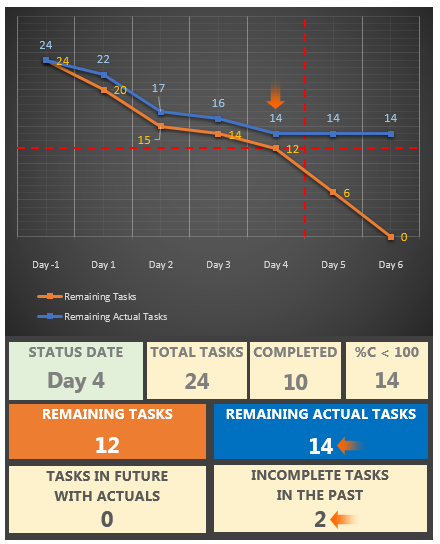
Note -- These task table
elements displaying formula results in the chart
(i.e., the formula tables) can be easily used in
the other reports within the same project plan
file too by copy/pasting. In order to use them
in other project plan files, you need to copy
the report to the
Global.mpt along with the custom fields
by using the
Organizer dialog box. Then all the
project plan files opened on the same system
will automatically access them --
If you do not prefer to
show the data table on the bottom of the chart
or even the labels on the line graphs, you can
use a combination view where the timephased
table on the bottom pane and the chart on the
top pane, as demonstrated in previous sections.
If you are not interested in how the numbers are
trending over time, you may use only the tables
with formulas instead of the chart in order to
show the values on the status date, as we have
just explored above. In case, you just want to
show the fields’ values on the status date with
no additional information, you can insert a 100%
Stacked Column chart to the report page, which
plots three fields on the status date by setting
the time category’s start and finish dates to
the status date, as it is seen below.
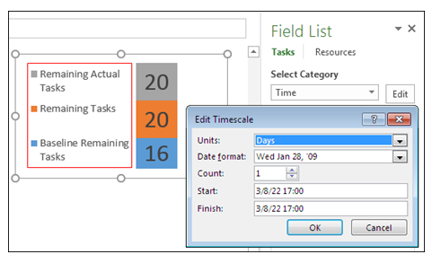
This section concludes our
discussion on the task burndown chart. So, having
already read all the sections, you can now decide on how
to make use of these charts to your benefit while
planning and managing projects in your particular
project environment. Focusing on number of remaining
tasks data may prove to be useful in daily tracking and
forecasting team’s progress during the execution of
short-term projects composed of tasks that can be
divided into equal non-dependent portions requiring
identical and mostly mental type of work to complete by
small teams whose members ideally possess similar skills,
knowledge and experience.
Building a
Custom Work Burndown Chart
Three reports in the built-in set
contain the WORK
BURNDOWN charts, as
shown in the following table:
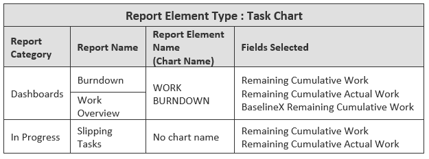
The
Reports dialog box can be used to access these
reports. Notice in the table that the task chart in the
Slipping Tasks report
of In Progress
category does not include the
BaselineX Remaining
Cumulative Work field.
Note -- As
MS Project allows inserting hyperlinks to the graphical
report pages, some built-in reports contain links to the
websites that contain the product help articles on
various topics such as baselines and burndown reports --
When we open the
Field List pane for
any charts above, it shows all the fields included in
the chart (see the column Fields Selected in the table
above) as well as the common settings applied to all the
charts, as shown below:
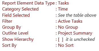
Based on these common
settings, all the task charts listed above plot
the line graphs of the selected fields’ data
stored in the task-timephased category against
time at the project summary level for the entire
project.
Note -- Inactive Tasks in MS
Project Standard |
Suppose that you create a
project plan file in MS Project Professional,
that contains some inactive tasks, and then a
team member at a different location opens it in
MS Project Standard. MS Project Standard treats
the Active
field of that project plan file as a read-only
field. As a result, an inactive task is
recognized, but its status cannot be set to
active. In that project plan file, the read-only
Active field
is set to Yes
by default for a new task created. The built-in
filter Active Tasks
can be applied to the read-only field. Thus, in
MS Project Standard, the
Active Tasks
filter can be applied to the tasks in a chart or
table element in a graphical report in that
project plan file.
In a project plan file
originally created in MS Project Standard, the
Active field
is recognized in a filter, but it actually means
All Tasks (or
no filter) since there will be no inactive tasks
in this project plan. On the other hand, the
Active field
cannot be inserted to a task table nor can it be
referenced in formulas; that is, it does not
exist. Therefore, the
Active Tasks
filter in a graphical report in this project
plan file will be the same as the
All Tasks
filter and does not trigger any error --
Note -- The
Create Reports
report of the Getting Started category contains a task
chart with the title
TASK BURNDOWN
but the chart plots the fields
Remaining
Cumulative Work and
Remaining
Cumulative Actual Work against time,
instead of the fields holding the number-of-tasks data. Having mentioned this, these are the
default reports that can be easily modified and
customized --
Important Note -- In
order to interpret the information presented by
the WORK BURNDOWN
chart, we first need to understand how MS
Project calculates the planned, current or
scheduled and actual work data stored in the
fields, Remaining
Cumulative Work,
BaselineX Remaining
Cumulative Work and
Remaining Cumulative Actual Work. It is
recommended not to continue reading if you have
skipped the previous section that covers all
three fields in detail --
We are now going to create
a custom work burndown chart, based on the same
example project and progress status scenarios as
in the previous section, to see how the graphs
on the chart look like on each of these three
scenarios discussed before.
According to the estimated
schedule, the amount of effort to accomplish
each task in the example project would be the
same and the tasks have been distributed evenly
over the days of the example project, therefore,
the line graph of the remaining cumulative work
will initially have a uniform negative slope in
the work burndown chart just like it was in the
task burndown chart. Since also we are going to
apply the same scenario in the demonstrations,
the resulting trends in the line graphs in the
work burndown chart will be the same as those in
the task burndown chart, as we proceed through
the steps. On the other hand, in real life
projects, the number-of-tasks data and the work
data may not follow the same distribution
pattern over time and they may not even have a
trend of any kind in the estimated schedule.
Scenario 1/3:
Team’s Progress on Schedule
The following is the chart
that plots the example project’s planned,
scheduled and actual remaining work data, after
it has been updated with actuals at the end of
the status period, Day 1.
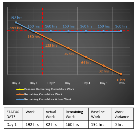
In order to review the
data while interpreting the graphs, a data table
can be inserted below the graphs instead of
displaying the labels at the data points or a
combination view with a task usage data at the
bottom can be opened as described before. The
formula table below the chart shows the
project’s various work data at the project
summary level as of the status date.
The remaining cumulative
actual work’s blue line graph merges with both
the orange line graph of the remaining
cumulative work and the yellow line graph of the
baseline remaining cumulative work (behind the
orange one) at the data point corresponding to
160 hrs at the end of the status period. The
blue line graph stays horizontal at the current
number of remaining cumulative actual work in
all the future periods. As a result, the project
is on track in this period since the team has
actually completed all the work scheduled for
this period.
Rescheduling the
Work
Now let us see how the
work burndown chart looks like on each step of
the scenario as we proceed with them, as
follows: shift some of the scheduled work to be
performed on the two tasks of Day 2 to the last
day of the project:
We can achieve this
schedule revision by either method; remove the
existing two tasks from Day 2’s task list and
then add them to Day 6’s task list, or move
tasks from Day 2 to Day 6 by drag-and-drop
scheduling. Both methods result in the same
chart below since deleting tasks does not affect
the summary level work data stored in the
baseline rows. The latter is preferable to the
former, since it avoids the step of defining new
tasks.
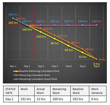
In the chart above, comparing the
Baseline Remaining
Cumulative Work field’s line graph with that of
the Remaining Cumulative
Work field shows us the changes that have
occurred on the distribution of the remaining cumulative
work over periods, which would otherwise be difficult to
see by reviewing the task-timephased numbers in the
Task Usage view.
So, we can update the baseline and proceed with this
scenario.
Scenario 2/3: Progress
Ahead of Schedule
At the end of Day 2, the team has
reported that more work has actually been completed than
was originally scheduled in this period since they have
also finished three future tasks from Day 3. At this moment, we already know
that the team’s progress is ahead of the schedule at the
end of this status period, but we need to update the
project schedule with the progress information reported
in order for it to reflect the current status as of Day
2, so that the resulting chart shows us the current
status of the project graphically based on the remaining
amount of work and also enable us to forecast the future
progress. The following pictures show the
data points of the graphs in Day 2, before and after
three future tasks have been moved back from Day 3 to
Day 2:
By this update in the schedule,
the
remaining amount of scheduled work in
Day 2 has been reduced from 144 hrs to 120 hrs; compare
the orange data points of the remaining
cumulative work graph in both pictures above. But since
the schedule’s status has not been updated yet, the blue
data point of the remaining cumulative actual work graph
is still at 160 hrs in the second picture above. As soon as the status of the
schedule has also been updated by completing all the
tasks in Day 2 (e.g., entering 100 to the
% Complete field),
the remaining cumulative actual work graph merges with
the remaining cumulative work graph at 120 hrs, see
below:
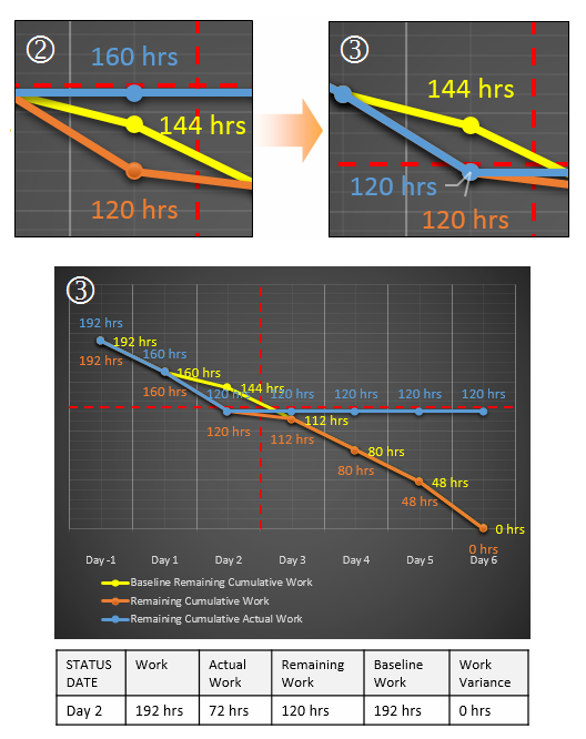
Note -- The graphs are usually plotted to
visualize any trend that may exist on how the data
change over time, therefore, the data labels displayed
on the graphs crowd the chart with information
unnecessarily, as it is seen in the chart above.
Instead, you may either add a data table to the chart or
use a combination view with a usage table on the bottom
when you want to see the work hours at the data points
along with the graphs --
Thus, as the Day 2’s frames before
and after all the updates (see below) show us both
graphically (by comparing the steepness of the graphs)
and numerically (by comparing the data labels), the
team’s progress is ahead of the schedule in this status
period since the amount of scheduled work that has
actually remained at the end of Day 2 (see the blue
label on the right, 120 hrs) is less than the work hours
that was originally scheduled (see the orange label on
the left, 144 hrs):
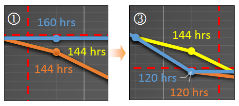
The data point of the
Baseline Remaining
Cumulative Work field’s line graph (see the
yellow one) shows us what the previous remaining
cumulative work value was in that period before the
schedule has been updated. That difference will
disappear as soon as the baseline has been updated. It
is important to note that the difference between the
data points of the remaining cumulative work (the orange
one) and its baseline in this period is not a variance
to the baseline, but instead, it just shows that the
backward cumulative distribution of the remaining
cumulative work data over time in the current schedule
has changed and it is now different than that of the
previous cumulative work data captured in the baseline.
As it is apparent from the data points at the start of
both the orange and yellow lines being at 192 hrs (total
project work), there is no work variance at the project
summary level in the project. But since we will be
looking for the resulting values rather than the
distribution trends on such changes, it would be better
to track the work variances to the baseline by using the
associated fields in a task table, especially while
evaluating the project status in any period during the
execution phase of a project (see the formula table that
shows zero work variance on the 3rd chart).
Therefore, we will continue the demonstrations without
the baseline. Baselines can be set and cleared on the
fly while working on various distribution scenarios, for
example, just before doing any changes to the project
schedule.
Scenario 3/3: Progress
Behind Schedule
Eight hours of work scheduled for
Day 3 were completed. Now, at the end of Day 4, this is
the project’s status in terms of the remaining work as
depicted by the chart below, after having updated the
project schedule with the progress information reported
by the team: 80 hours of scheduled work should have
remained at the end of Day 4, but the team has actually
completed less work than scheduled in this period, so
the remaining cumulative actual work value reported is
96 hours. As a result, the team’s progress is behind the
schedule in this period.
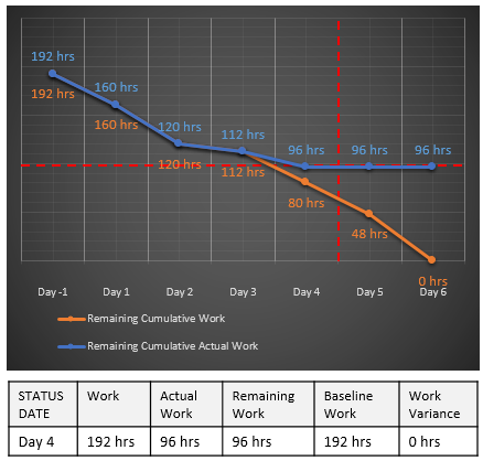
Now we will move Day 4’s
incomplete work to the next day. As it is seen in the
second frame below, the remaining cumulative work graph
merges with the remaining cumulative actual work graph
at 96 hours. And the steepness of the orange line graph
increases toward Day 5 since more work has to be done
now in Day 5 than before.
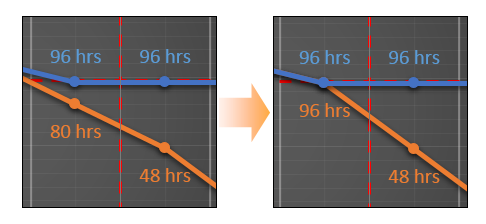
Regarding our example project; it
is important to note that we have discussed the
project’s status within each status period on each step
of the scenario and the corrective actions taken after
the status was evaluated have affected only the
distribution of the scheduled work that remains but not
the project’s finish date since no delays were recorded
while updating the schedule and also since the tasks
that have been moved have no dependencies (that is,
there is no critical path that controls the project’s
finish date). Therefore, at this point, if the remaining
cumulative work graph gets too steep in the future
periods because of the incomplete work that has been
shifted ahead to these periods, it is required to verify
that the amount of work allocated to the team in the
remaining periods does not exceed the team’s work
capacity and availability. Based on your prediction on
whether the team might be able to complete all the
scheduled work that remains within the remaining project
duration according to the current schedule, you may now
decide to take some preventive actions to eliminate any
potential performance issues in the future periods that
might arise from overloading the team even when MS
Project does not alert for any overallocations at the
moment. Depending on the type of the project, a
trendline added to the
Remaining Cumulative Actual Work field’s line
graph can be used to forecast whether or not the team
might be able to reach zero remaining work on the
estimated finish date based on their past performance.
Completing the Project
This is the chart at the end of
Day 5 where the team’s progress has been as scheduled:
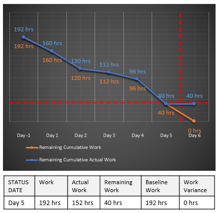
This is the chart of the completed
project with zero remaining work, as scheduled:
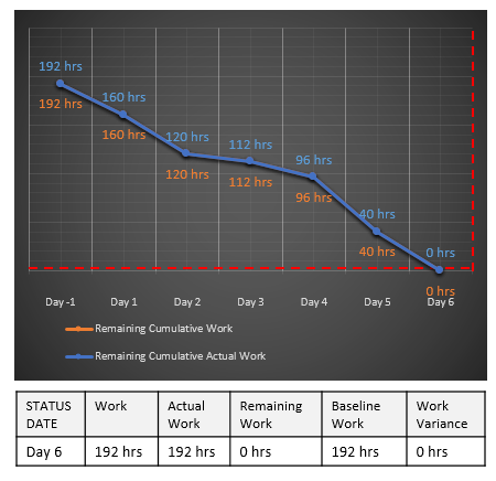
In the formula tables below the
chart, both the current and actual work values at the
project level show 192 hours now.
· · ·
The content above has demonstrated how
to use a chart plotting the line graphs of the fields
Remaining Cumulative Work,
Baseline
Remaining Cumulative Work
and Remaining
Cumulative Actual Work while tracking progress in
a fixed-finish-date short-term, possibly internal, project
implementation scenario. In such projects, the actual
work usually starts off with a rough plan, and
therefore, how the scheduled work that remains is
distributed over the project’s remaining duration
changes as the details become known and are reflected to
the project plan during the course of the project. And
some scope changes implemented may add up to the overall
work scheduled for the project. The project team is
expected to be flexible enough to adjust for such
fluctuations in the workload. In this scenario, it is
better to focus on the amount of scheduled work that has
actually been left to be completed from the status date
on, rather than the amount of
scheduled work that has actually been
completed to the status date. Thus, having
considered the team’s work availability and capacity in
the remaining periods, as well as the team’s past
performance to date, a work burndown chart may help you
in predicting whether the team might be able to reach
zero remaining work on the fixed-finish date.
eBooks on MS Project
|
eBook
(pdf)
|
Mastering
Custom Field Formulas in MS Project
Details are available
here
 |
eBook
(pdf)
|
Using MS Project’s Built-in Functions in Formulas
Details are available
here
 |
|
eBook
(pdf)
|
Text Reporting in MS Project
Details are available
here
 |
eBook
(multiple - kindle & pdf)
|
Handling Multiple Hours-Per-Days by Using Custom Field
Formulas in MS Project
Details are available
here

|
|
eBook
(pdf)
|
Understanding Initial
Assignments in MS Project
Details are available
here
 |
|
|